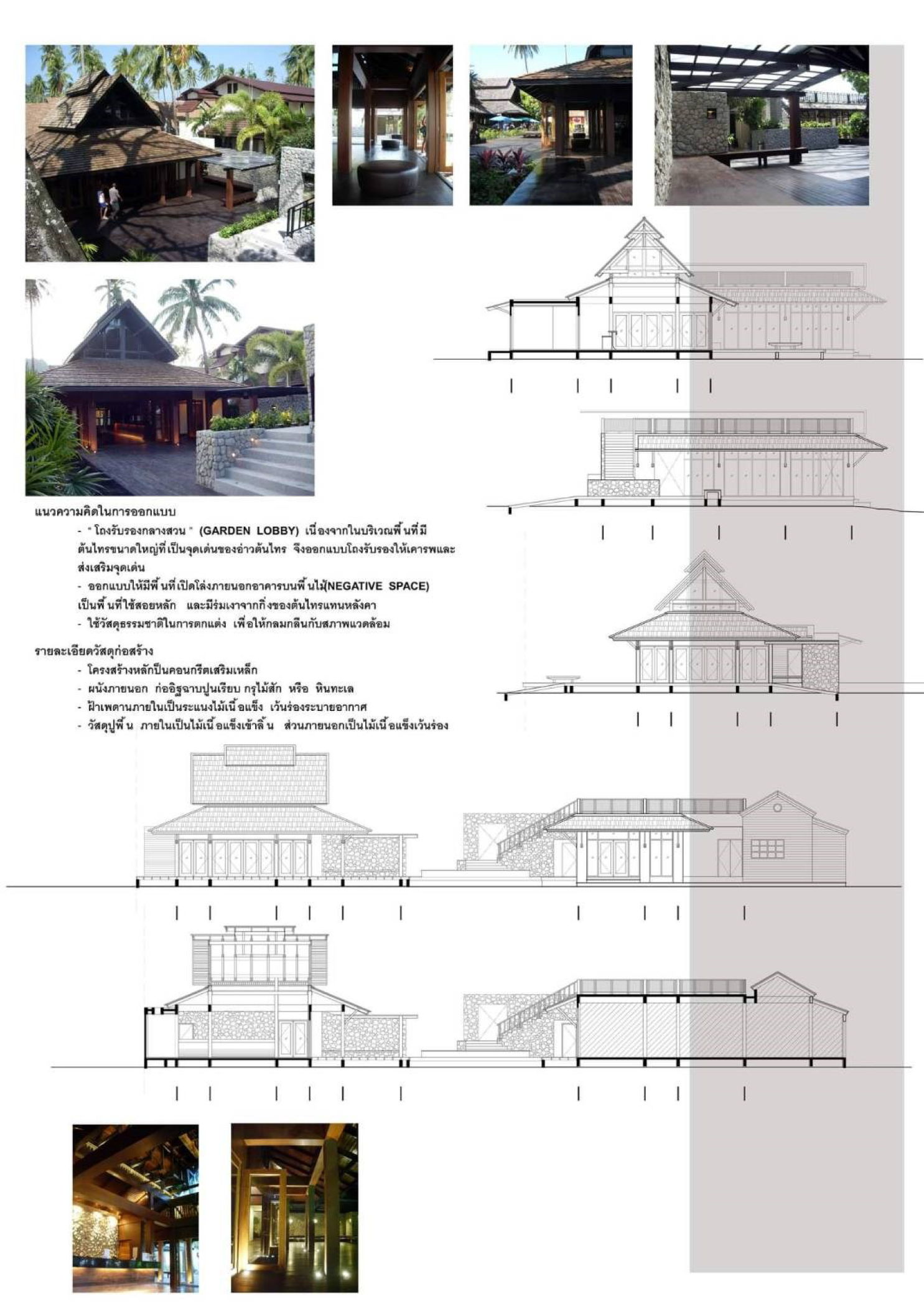
In 2008, three years after the first tsunami destroyed the structures in most parts along the south-western Thailand coasts and islands, PP Hotel group decided to renovate all their hotels. One of them was the Banyan Villa Resort which is located on the most popular site of the Ton Sai Harbor, Ton Sai Bay, Phi-Phi Island. The lobby, an entrance-gateway to this resort (about 300 sqm.), consisting of front desk, souvenir shop, back of the house office, bakery shop, public toilet and storage, was re-erected.
The new lobby site was set up in-between the guest room clusters and beach-front promenade walkway, behind the open-air dining place (Banyan Restaurant). The focal point of this site was the two-big holy Banyan trees (Ton Sai), the symbol of which the bay was named after.
Our design aimed to create this new lobby to represent hospitality, suit to the tropical terrain and unique to the Phi Phi Island. The design methods are as follows:
Garden Lobby The beautiful huge Banyan trees and tropical seaside landscape (Scaevola) inspired us to combine landscape and architecture to be “Garden Lobby of Banyan Villa”. We used negative space (shady wooden deck) as the main lobby function. The supporting functions such as front desk, office, souvenir shop, public toilet and bakery shop were put in wooden pavilion and the old lobby building.
Outside in and inside out The main Garden Lobby was located on the elevated wooden deck under tropical shade of Banyan trees. We designed the main entrance from the walking street with a big wooden ramp (for the convenience of moving the luggage) that led to the main Garden Lobby and to the lobby pavilion. The same wooden material and the same floor level helped create the feeling of connectedness from outside to inside.
Nature-led design We used natural ventilation for this Garden Lobby by making it an open-air area for the guests to feel the natural surroundings of Phi Phi Island. We combined natural landscape such as Banyan trees and Scaevola with the main open deck lobby.
We tried to use natural materials especially hard wood and stones as main materials for structure, roof, wall, panel, floor and built-in furniture to create warm and friendly atmosphere that reflects vernacular architecture of the island.
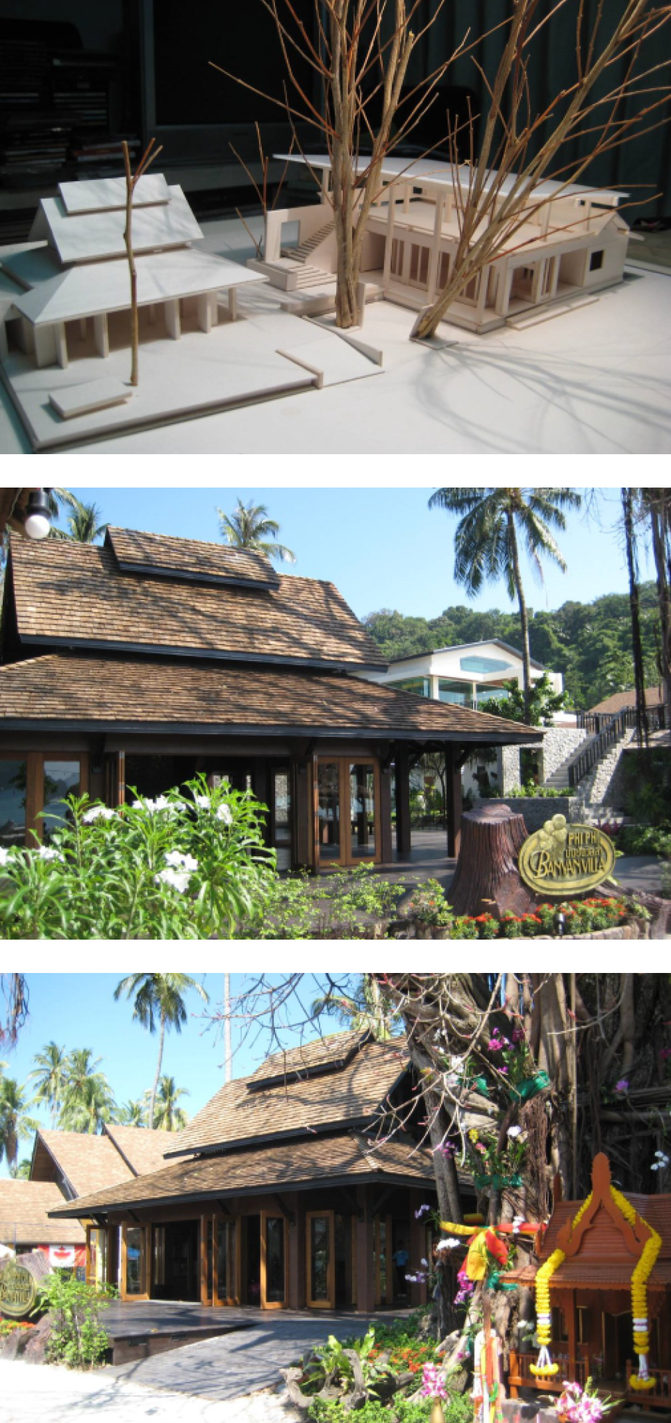
Conclusion
By the day this Garden Lobby finished and opened to public. This beach front area was lively and more fascinated including the two big holy Banyan trees (symbolic of Banyan bay).
Objectives Aims or Purposes
1. A Gateway of Phi Phi Hotels Group 2.To Respect Spiritual Context 3. One of the Tropical Vernacular Architecture of Phi Phi Island
Process or Methods
1. Programming (Lobby Area 300 sqm., Souvenir Shop, Office,Storage, Public Toilet, and Bakery Shop) 2. Site survey and conceptual observation (Our team explored and stayed in Phi Phi Island around 10 days to measure project site and survey all the Plant especially 2 big holy Banyan trees in front of Banyan Villa Resort.These name Banyan Bay (Ao Tonsai) 3. Concept Design 4. Design Development (after various alternative studies,the existing Banyan Trees and New Lobby Pavillion defined themselves as a Gateway of the Garden Lobby to the Hotel Room clusters.) 5. Construction Drawing 6. Construction (Monthly site visit and provide Shop Drawing for necessary details) 7. New Banyan Villa Resort started to present the first Key in 2010.
Techniques and materials
We created new perception for guests of Banyan Villa Resort by designed main Garden Lobby and support functions including existing environment.
The Translation Process We purposed the modern architectural design to communicate international appearance while welcoming clients, yet expressing local identity. Solid and void pattern responded to each side the building confronted. Large voids left just the column skeleton structure
that looked like “Sala” (an open pavilion) in Thai architecture. This appeared on 2 sides in front of the lobby to welcome the oceanic scenery and the Big Banyan tree. Situated in the Phi Phi tropical climate, we borrowed some local hat-like pitched roof and sun-protection elements and simplified them for more neutral looks and the ease of long-term maintenance. The rectangular box on wooden platform covered by steep-sloped roof with extended eaves at all sides acted as the transition from the outside surroundings into the accommodation, combining the negative and positive space and reflecting the tropical vernacular architecture of Phi Phi Island.
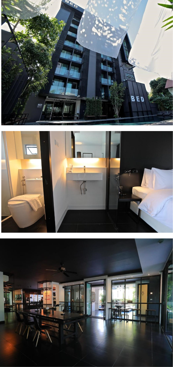
This project describes the conversion from rental apartment to hotel, a process that avoids demolition of existing structures by utilizing its potential to repurpose and reuse buildings, thus avoiding expenditure and unnecessary loss of raw materials, resources and energy. Usually, these imposing buildings were placed in central locations and were well-connected to the touristic area. This article reveals an apartment building which has become a modern hotel, as an example of urban transformation and modern coexistence. The design concept adapted the existing structure with a minimum of demolition and maximizing its opportunities through an adaptive room layout. While using the existing form, the overall exterior was modernized through the use of tempered glass balconies and an abundant use of black composite. This property was originally built in 1998 in the Nimmanhaemin area, Chiangmai District. As rental apartments, it offered both short-term and long-term stay, and functioned as such until 2016 when it was renovated as a hotel. As the Nimmanhaemin neighborhood underwent development into a significant touristic area in Chiangmai, the building remained slightly behind until it was picked up and renovated into a hotel that would cater to both international and domestic tourists. Nowadays BED Nimman hotel offers an experience for travelers who want to stay in the modern urban areas of Chiangmai. In this convenient location the hotel was renovated and now includes state-of-the-art amenities and features a swimming pool, multiple-common areas, and a clean design. This case study provides valuable lessons in repurposing the potential of existing buildings and validated the possibilities of Clean Design to contribute to building environment
Conclusion
As shown in BED Nimman Hotel, the method of renovation is optional to newly-built construction projects, especially when the concept is to transform the pre-existing context of an apartment building into a modern hotel that fits nowadays tourist behaviors. The final impact is the combined result of architects and the GM, intensive consultation with project and hotel staff and a constant attention to the news of guests. The realization and design guidelines of BED Nimman Hotel (2017) were directly connected with previous experience gained during the renovation of BED Phasingh Hotel (2015) and BED Changkian Hotel (2014). It seems as though the function of existing buildings in the city is rather significant, and their importance continues to increase. This project can be useful when assuming similar cases in the future: renovation of existing buildings and redesign to add property value and guests’ satisfaction.
Objectives Aims or Purposes
The purpose of this project is to renovate a rental apartment into a hotel that caters to the modern hospitality industry. Its overall aim is to enhance services, enrich the tourist destination itself and create an experience for both domestic and international travelers. As the repurposed building in this case study aims to cater to modern-day travelers, the design has to reflect the lifestyle and behaviors of its users and their associated expectations. As such the design uses a minimum of decoration and form, focusing instead on understanding the essential functions of modern hotels. Located in the vibrant Nimmanhaemin area, the design of the hotel and the market segment is consistent with the nature of its urban context. The project embodies a different and cost-effective design approach that benefits both the increased demand for tourist accommodation and the decreased demand for rental apartments. The project aims to reduce the typical construction time from 18 months for new structures, to 6 months for conversion. At the same time the project aims to reduce the investment from 150 million Thai Baht for a new building to 30 million Thai Baht for the conversion process. The renovation project is to achieve the following objectives:
Aesthetic – The appearance provides a new look without changing the layout of the original space but includes repainting walls, adding the vertical metal frames, tempered glass, new floors, and changing the overall design. This renovation used the pre-existing aspects instead of rebuilding them. Enhanced Room Design Layout – Altering the design of the 3 room types involved moving appliances and sinks to create a better and more efficient layout. The triangle concept was used in the layout: sink to the cupboard to the toilet and back to the sink. Redirected Traffic – Changing the flow of traffic in the lobby area included adding additional doorways, floor-to-ceiling glass windows, and communal breakfast tables, resulting in more efficiency and a more spacious look. Increased Space – To enlarge working space, kitchen areas were incorporated in the main lobby and fixtures and appliances were rearranged. This resulted in more space and an increased multi-functional area, whilst increasing the usefulness of lobby space. Expanded Outward Area – This was the most extensive part of the renovation project, as it involved adding additional leisure space. This was achieved by combining interior and exterior functions in the same area. The swimming pool area completely changed the flow and design of the breakfast area, as well as the overall perception. It also created additional opportunities for guests to relax in a more appropriate atmosphere.
Process or Methods
BED Nimman hotel was constructed to rehabilitate, reconfigure, and add value to the property. The project includes a new exterior façade whilst maintaining the original structure, new bathrooms, redesigned hotel room interior spaces, an expanded lobby area, and provides additional guest facilities. Construction activities included technology upgrades to improve connectivity, security, control, and leisure functions. In general, architectural renovations are relatively inexpensive compared to the significant engineering cost of newly constructed projects. The hotel was able to execute the renovation activities with minimum disruption for the surrounding area. The construction time was 6 months and completed according to schedule. This methodology requires careful planning, budgeting, and financing by integrated plan in order to save time and money.
Techniques and materials
As this hotel involved an already existing building, the possibilities of adaptation were somewhat limited due to the post-tension structure and the regulatory building codes. It was possible to meet the requirements despite the fact that the existing functions were designed for long-stay guests. The original layout maintained the same floor plan, whereas the walls between the rooms were made sound proof. The design of the hotel rooms anticipated a solution which brought about associations with modern hospitality: elevations finished with decorative profiles of black metal and composite paneling, the black and white interior created an atmosphere of simplicity yet relaxation A contemporary reinterpretation of appearance in the elevation was carried out on a part of the existing building from all sides. It was created using less decoration to give it a more minimalistic character. As a result, all of the design is consistently different from its existing character and guest rooms now feature large windows,
The Prototype Design of Urban Kiosks: The Case Study of Khaosan Street,
Bangkok.
Ms. Benjamas Thonglorlers,Ms. Narisara Jantharangsri / Ms. Siriporn Ruangsiri, Dr. Parisa Musigakama / and Mr. Punnarat Jarungkon
Introduction
Khaosan Street is a world-famous accommodation area for backpackers and a colorful street market. In 2020, with the aim to develop into a pedestrian street with an international image and standard, BMA improved its physical environment and had the policy to reorganize the space utilization. Since the key elements of this crowd-pleasing space are the kiosks. The idea to develop a prototype of the kiosks that will be used in the refurbishing area was raised.
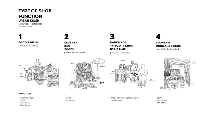
This project was initiated as a collaboration between the Faculty of Architecture and the Khaosan Road Street Vendors Association, with the Buddy Group supporting the design budget. 4th-year students under SOS Studio are responsible for design work under the guidance of advisors. In terms of methodology, the students applied the design thinking process. Data were collected and problems are defined by observations, interviews, and discussions. The design focused on 7 objectives, which are 1) strength and durability 2) easy disassembly 3) mobility 4) low construction budget 5) Thai identity, 6) product and environmental hygiene and environment,
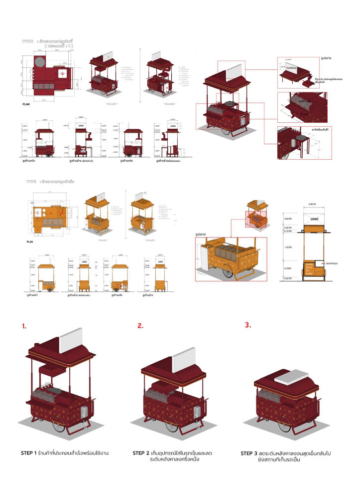
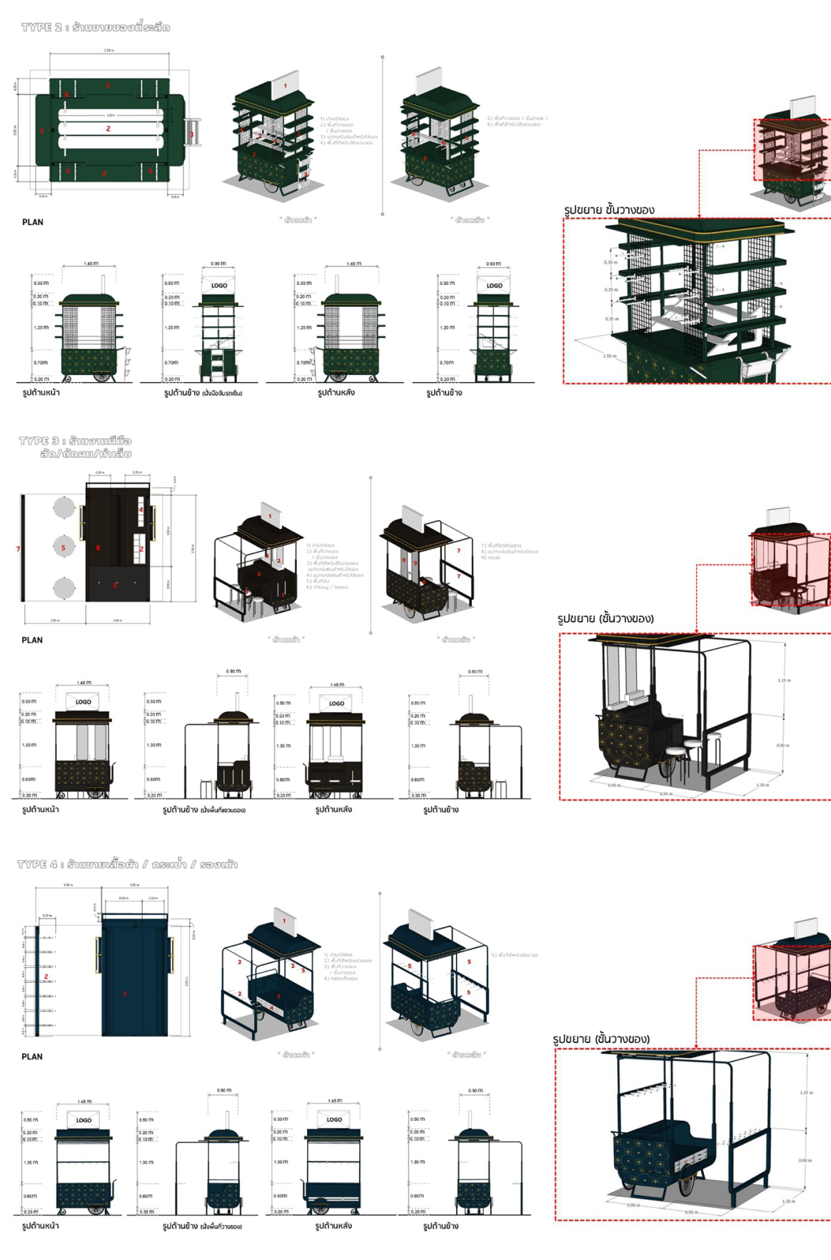
and 7) able to generate a return on investment for the investor. The kiosks were designed into four categories based on the type of products: food and drink, clothing, handicrafts, and souvenirs. The designs give importance to the existing way vendors perform with the kiosk on a daily basis but improved it in terms of images and details. Contemporary Thai motifs and Thai tone color were applied to present the contemporary Thainess. The budget for developing a kiosk is 30,000 baht each. Since most vendors may not be able to invest in developing their own kiosk.
The Khaosan Road Street Vendors Association wishes the kiosk could generate revenue back to the private investor by providing advertising space upon each kiosks. This is an innovative business model presented through design output. The idea and design have been unofficially accepted by the Bangkok Metropolitan Administration, unfortunately, the implementation is still not possible due to the epidemic and regulatory issues.
Conclusion
The kiosk prototype design project is a good design challenge that allows students to understand the possibility and potential of tiny movable architecture in place rebranding. Students had a chance to understand the usability of a very small space and details that are not commonly found in architectural works. They also learned the design process that required reference data from field surveys, observations, and discussions with project owner.
Although the look and feel of the design work might not look very different from the kiosks commonly found in indoor commercial spaces in Bangkok. But when examined in detail, the design has faced and tried its best to solve the problems of outdoor kiosks design that has always existed. Enhancing hygiene. Creating a unified yet diverse and vibrant image in a way that people on Khao San Street would appreciate. Allowing vendors an easy to modify and repair with common materials in the market. Building a weather-resistant kiosk for everyday comfort. Considering everyday transportation by creating an easy disassembly and movement. Most importantly, the design is planned to support a post-pandemic tourism. The collaborative design process between designers and vendors to create a more welcoming and sustainable environment for everyone is a good sign for more sustainable co-create public space.
The design satisfied the project owner and should be push to construction process, but has been slowed down by the sluggish tourism situation due to the epidemic and regulatory issues. The idea of having the private sector invest in the development of urban kiosks in order to create a contemporary and unified image of Khao San Street vending is not suitable for current regulatory conditions. Alternatively, developing a kiosk design approach to encourage individual vendors to develop their own may be a more appropriate approach. This will be our study topic in the future.
Objectives Aims or Purposes
1. To design the prototype of urban kiosks on Khaosan Street to support BMA’spolicy on environmental improvement and space re-organization and to meet the new-normal-way of street commerce after the pandemic situation. 2. To support the place rebranding of Khaosan Street to the international standard and image, highly focused on orderly, identity, value, and cleanliness. 3. To develop students’ design skills through hands-on experience.
Process or Methods
The urban kiosks have been interpreted as the movable architecture that will turn Khaosan street space into a dynamic market space. The trade on Khaosan Street takes place almost 24 hours from early morning until late at night. The street which was only two hundred meters long has to be allocated effectively to accommodate 230 vendors. Each kiosk is set to be within 2×1.5 meters in size. Design thinking is therefore used in the design process as in general architectural design which are (Gupta, 2020); 1. Emphasized and defined design problems through a variety of methods, including observations, interviews, and discussions. 2. Case studies research. 3. Ideated and developed the alternatives for discussions. 4. Developed a final prototype for construction. The most complicated process for students is understanding how the space is used in relation to product categories. The design required to be disassembled with simple tools in a short time and can safely move to the warehouse every day as the spaces need to be turned for other vendors. As this cyclical process of use happens every day, the kiosk has to be robust but light weight. Importantly, the design work must be simple and flexible enough to allow each vendor to adapt the kiosk to their own needs. The entire design process was developed in consultation with vendors’ representatives for further presentation to the Bangkok Metropolitan Administration.
Techniques and materials
We interpreted this kiosk design as a movable architecture to emphasize the importance of the kiosks as an architectural element in public spaces. Not only will the kiosks play a role in shaping the structure of the market space, it also creates a dense, circular, and dynamic mix of space. Furthermore, the kiosks are the important media to generate more conversation in these public spaces (Whyte, 1980). Vendors spend most of their time in a day here in any weather. They run their business and be local host to the visitors at the same time.
The stalls were originally designed by individual vendors with materials they could easily find at affordable prices. The image of the street is formed by various designs, although entertaining to tourists, lacks unity and order in the eyes of the government officials. On the occasion that Bangkok has developed a master plan and renovated the road to be a walking street. The idea of developing the kiosk with a unified identity and in line with the new pedestrian style was raised (Pornpetrumpa, 2020). The kiosks are expected to be one of the elements that play an important role in place rebranding from clutter to a pedestrian street with a unified and orderly image.
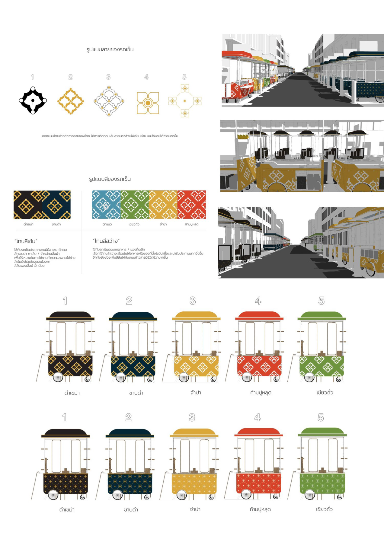
Visually, the students accepted the idea from vendors to design the impressively colorful kiosks that will proper for Khao San walking street. The students suggested choosing Thai tones as an alternative by applying them together with Thai motifs that have been applied to be more contemporary. Color and motif schemes were analyzed to suit the type of product. They offered both relatively light and dark tones as an alternative for vendors to consider, compare and make decisions.
Size or Mins.
–
Image 2: Kiosk design for food and drinkImage 3: Kiosk design for souvenirs, handicrafts, and clothingImage 4: Thai tone color and graphic study to represent contemporary Thainess
A Clean Design Emerged by the Integration of Minimalism and Sense of Place at ON Thapae Hotel
Assistant Professor Dr. Aviruth Charoensup
Introduction
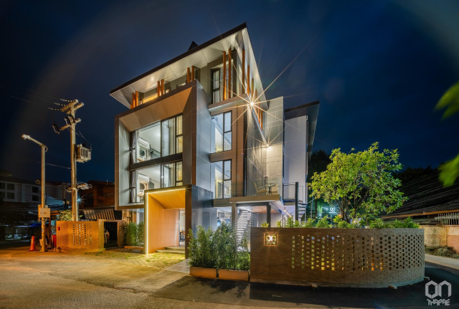
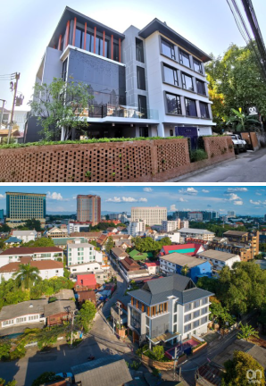
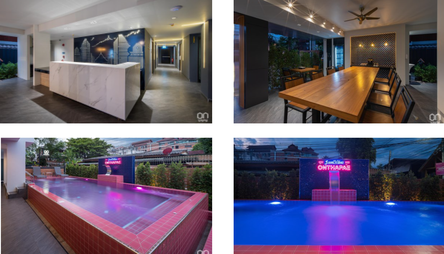
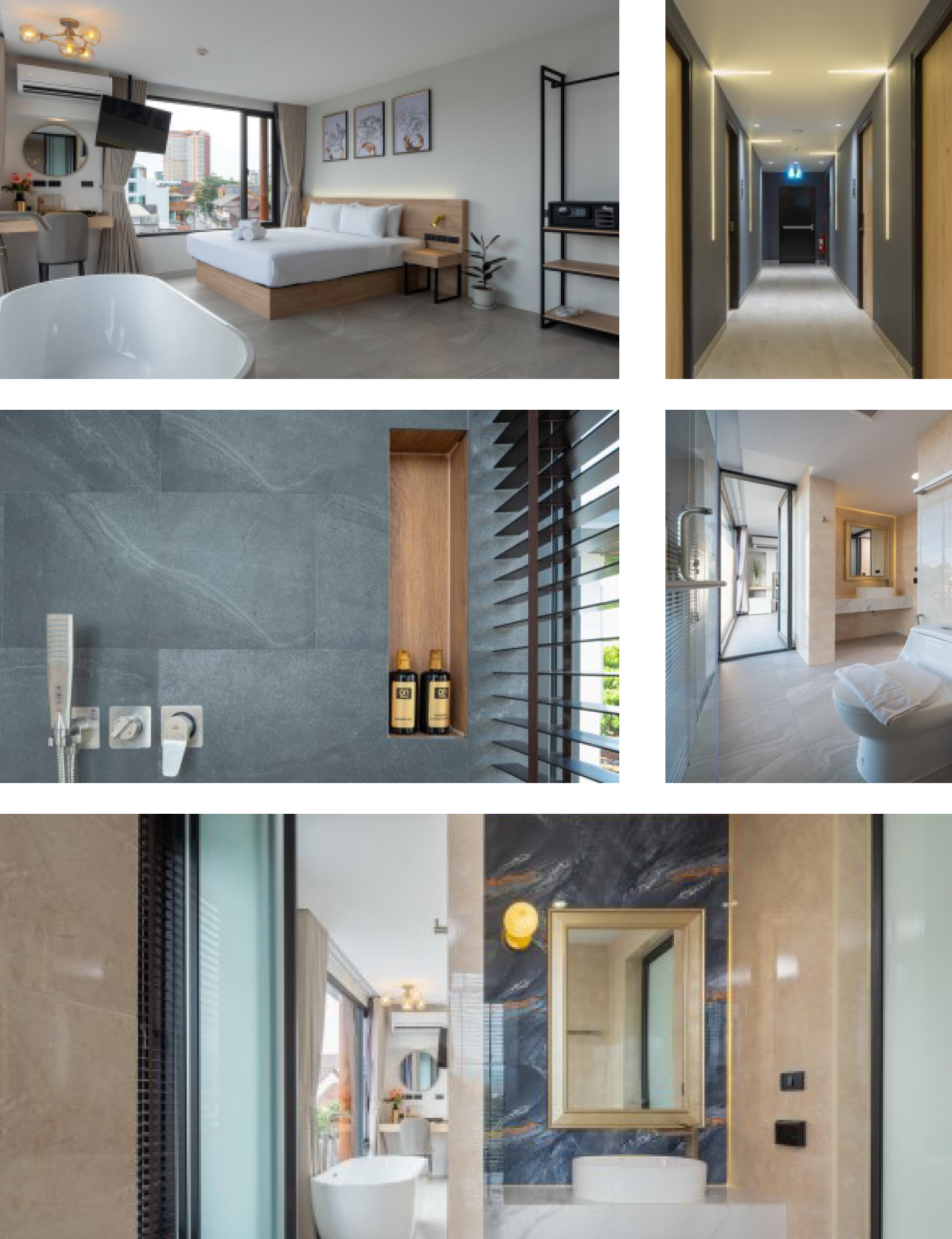
The ON THAPAE hotel is a city hotel which is situated in an urban and historic area of Chiang Mai, Thailand. It is only a 5 minutes-walk to Thapae Gate Plaza which is the center for major cultural and traditional ceremonies of the city. This tourist spot also gives many links to the inner ancient city. The hotel was just newly opened in 2021 with 27 guest rooms. It contains 5 room-types which are double-bed, twin-bed, suite, deluxe suite, and family for 4. The program was set to be a boutique hotel where the expected focus groups are international couples, and the length of stay is 3 days on average. On the ground floor, the hotel has only a multi-purpose space for breakfast in the morning and working space all day. The self-service coffee machine and free drinking water are ready to serve for guests all day. The swimming pool with pink-colored tiles intentionally gives hotel guests a freshness after being exhausted from the city exploration. The hotel guests who lie down or sit on the pool terrace can hear the sound of water that overflows from the swimming pool, can feel the breeze, and can see the green leaves of the garden. This sensory design helps stimulate people’s perception and creates a relaxing atmosphere for the hotel.
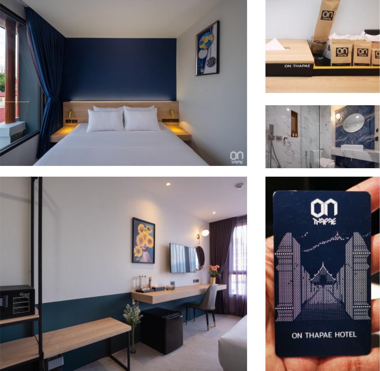
A clean design was involved in the design of ON THAPAE Hotel from the beginning of the project by using minimalism for architecture and interior design. The exterior of the hotel was designed in a simple geometric form, a typical modern language. The highest floor was differentiated from other floors in elevation by reducing its parameter and being painted in a darker color tone. The building top was installed by “Lanna Hip Roof” in gray color PVC roof tiles which could absorb the heat and produce lower noise than other popular materials. Then, the shape of the Lanna Roof was supported by round wooden-colored columns along the entire perimeter of the roof. This architectural design gives an international look that harmonizes with Lanna identities of the context. The design of furniture in guest rooms such as an open wardrobe, built-in bedhead walls, bedside table, and working desk is also in simple shape with wooden pattern. As the hotel offers free drinking water to any guest, a drinking water tap was installed at the corridor of the hotel each floor so that a guest can bring his own empty bottle to refill the drinking water himself. It is aimed to reduce plastic consumption.
Conclusion
As the “Clean Design” is a crucial approach to the design of not only the architecture but also the facilities, equipment, amenities, and other service items. The ON Thapae Hotel was designed to achieve this notion for exterior architecture by implementing minimalism plus local features. For interior issues, clean design was taken into account where the finishes were low-maintained or easy-to- clean. The elevator used in this hotel was installed with touchless buttons. The lobby and breakfast area was designed to be an open-air space, linked to the swimming pool terrace. The multi-sensory aspects were added to the design of the relaxing area beside the swimming pool, such as, sound of the water splash, smell of the leaves and flowers, vision of the green of the garden, feel of the breeze, and taste of the free-of-charge coffee service of the hotel.
Objectives Aims or Purposes
5.1 To explore the idea of how to use the “Clean Design” for a hotel case study which is “On Thapae Hotel” 5.2 To demonstrate the design outputs and outcomes of “On Thapae” in various aspects
Process or Methods
The “ON THAPAE” can be categorized as such a kind of real estate that its methodology may be broader than art, architecture, or any design works. It is described from the business start until the operation phase.
1. Business Values and Goals: Empathize goals of the owner, limitations of the local building codes, brand identities, and context of this hotel. The owner had set the goal that this hotel should have had a number of 25-30 rooms in total because of the practical module of service quarter and staff numbers. The price per room is at 2,000 Thai Baht, the hotel standard is set at about 3-star with a swimming pool. Foreign tourists, travelers, digital nomads (work online and travel), were set to be the target group.
2. Site and Context: The survey of the site and all physical settings was done firstly. Then, the data collection of the local context in terms of socio-economy, tradition and culture, as well as, significant architectural elements, including a few Chiang Mai’s specific regulations of this conservation area (ancient city’s boundary), was gathered in order to analyze the design constraints and opportunities. Because Chiang Mai is a touristic city that emphasizes crucially on cultural and traditional conservation, as shown by the control of the building form (Lanna architectural form required to be applied) and colors of the exterior. Eventually, on the other hand, it can be beneficial that this control was bounced back to be a selling point for the tourism industry.
3. Research and Case Study: After studying many cases of the city hotel in Chiang Mai experienced plenty of success, in terms of reputation and business by design, it was discovered that these were the most difficult parts to set an appropriate program and design for this type of city hotel, because of the high competitiveness. The result was that the uniqueness of the design might help penetrate the others to become outstanding, which inevitably had a contradiction between the budget and clean design. Many theoretical articles of “Sense of Place” were reviewed and decided how to adopt the design (Najafi and Shariff, Mustafa and Mina, 2011).
4. Building and Interior Design: Study of the improvisation of “clean design” and “sense of place” to achieve a philosophy of minimalism that could extend to the user’s perception of clean and hygiene environment, while representing “sense of place.” Room Interior Design was implemented by minimal philosophy, less is more in the part of bed base, bed head wall, bedside table, were all built-in finished with wood pattern laminate on plywood panel to cover steel structure. The clean design was shown in the shape, form, and colors of furniture that were simple and flexible. The steel rack for clothes made the space in the room feel lighter, but wide enough for 2 day-stay, which was the average length of stay as the given data. Public Space Design was fully intended to give a clear orientation to the users, and put in many efforts to be easily cleaned and low maintenance. At the corridor, floor finishing was all textured ceramic tiles which aimed to ensure safety of the users at various ages. The lighting was design to give focus. Building Design; it was an attempt to maximize usable area but not more than 1,000 Sq.M as per the city’s land use code. There was also the regulation that the exterior of the building be controlled to use only a few colors (white, gray, brown) and architectural features which should be in harmony with Thai Lanna Style. Therefore, the design outcome was to mix the contemporary modern at the bottom part of the building from the 4th floor part with a Lanna Hip roof in gray color at the upper level of the roof part. (See figure 1.2)
5. Operation Phase The hotel was opened in April 2021 by the time of COVID-19 pandemic. According to the necessity to get certification from the Health authority to control the spread, the hotel needed to improve many physical settings and management. Fortunately, the elevator was equipped with touchless buttons already. The screen at the counter and social distancing marks were placed. All finishing surfaces of interior in the hotel building and furniture more often required cleaning services, thanks to the durable and easy-to-clean materials used by the clean design.
Techniques and materials
As one mentioned, the “Clean Design” is the source of a good and fulfilling life where human users can reach their hedonistic sustainability. A few rules of “clean design”
were picked up to define how the ON THAPAE hotel was achieved by design. These rules, according to “the 10 Principles of Good Design proposed by master product designer Dieter Rams” (Duvall, 2022), are “Less, But Better,” “Be Neutral,” “Go for Timelessness,” “Be Thorough,” “Be Understood,” and “Make It Pretty.” These notions, as architectural design, interior design, graphic design, and hotel operation, can be amplified to get more understanding as followings.
1. Branding: Firstly, the logo was designed to have an outlook on sharp/geometric and bold form of fonts that aimed to represent the strength of a hotel developer company. Using the color theme of the hotel branding, pink and navy blue to navigate the design. The color is shown in the guest room bed head panel to identify room type. 2. Sense of Place: The Perforated Foldable Panel expresses Thapae’s local identity. Thapae Gate is the name of the district of the hotel’s location which is used for the name of the hotel as well. The design of perforated foldable panels on the second floor is inspired by the view of Thapae Gate from a distance that is familiar to many people as they approach the main Chiang Mai city’s plaza. This road axis has also historical importance for the city as it is the axis from east to west side of the city where the end of this axis is placed by Wat Phrasingh and the figure of “Doi Suthep” mountain is in the background. These artistic panels can be instragramable that will help the hotel promote in social media. 3. Minimal Scale: Minimum size and scale of the hotel guestrooms was designed to respond to the business requirement of having a total rooms in the number of between 20-30 rooms. This number reflects many aspects of management and service quality. Therefore, the guest room design was merely sufficient to stay with comfort in an area about 20-24 Sq.M per room. The minimum size of public space is actually controlled by the code. 4. Hedonistic Environment: Hedonistic design was added in the hotel by creating a relaxing place for travelers who are always exhausted from walking to explore the city at the swimming pool terrace. The infinity edge pool was intended to allow overflow water to fall down to the gutter at floor level which will create sound of water splash and waterfall. The pool was placed at the west to get the most sunlight for sunbathing and attach to the garden. The swimming pool was intentionally designed in pink color together with navy blue color of the branding, which was expected to give a new fresh look and a relaxing environment of the hotel. Hotel guests can lie down beside the pool, listen to the sound of water flow, see the green leaves moving, and feel the breeze. After sunset, this pool and terrace is lightened up by lighting that dramatically enhances the atmosphere. This area is also for family and friends to hang out by the pool. It is a kind of hedonistic space. 5. Amenity Design: Hotel accessories and amenities were used recycle based color to represent the awareness of the hotel for sustainability.
Size or Mins.
1200PxX1200Px
Figure 1 The front picure of ON THAPAE Hotel by lighting at night. The sense of place is expressed through the shape of “Lanna Roof” and the fence made from red clay brick inspired from “Thapae Gate.”Figure 2 ON THAPAE Hotel is located in the heart of Chiang Mai city. The exterior architecture is a modern language with a few accents of northern Thai.Figure 3 (above left-right) The hotel lobby, breakfast area, and co-working space are flexible to activate at the same time. (below left-right) Pink swimming pool offers hotel guest multi-sensory perception of relaxing and cheerful. It also looks dramatic at night with lighting design.Figure 4 The interior of Double-Bed Room, accessories, and amenities were clean design by integrating minimalism and local touch of wooden materials. The Navy Blue color is given from brand identity of ON THAPAE.Figure 5 The Deluxe Suite Room was displayed in beige color scheme. It was added a bathtub to gain more luxurious lifestyle. This type of room can get more natural light than the others, therefore, it looks more spacious.
Humans possess creative thinking ability. Our ways of thinking and acting are so powerful – they can create positive and negative impacts to the world. . “Clean Design” is the source of a good and fulfilling life where human users can reach their hedonistic sustainability
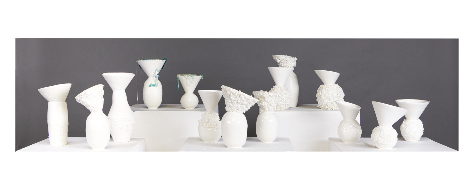
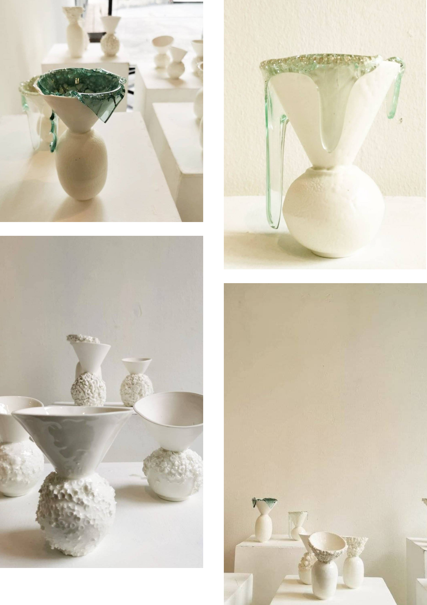
White Vase is an upcycling concept that takes waste material through the ceramic process into a useful product. By disposing of agricultural waste such as rice husks, loofah, coffee grounds, industrial waste such as foam beads, straws, culet glass and bubble wrap for transportation. It is designed to achieve aesthetic. add value to products Not only the texture and texture that is different from waste materials, it creates charm, but also uses simplicity. easy and a clean, white color by using porcelain body Formed by slip casting from paster Mold. The waste material is mixed with clay and putty is mixed with the product. Simple product shape by bringing used mold to create new shapes , Transparent Glaze at 1230 degrees Celsius , Show white body and simple clean design.
As a reminder of the creative use of waste To create knowledge exchange and waste management methods save the world environment.
Conclusion
White Vase is shows the Visual Texture and the Tactile Texture. As a result of the reflection of light. Surface absorption of the surface. Difference of texture Induce feelings. It has an interesting texture. And a reminder of the creative use of waste To create knowledge exchange and waste management methods save the world environment
Objectives Aims or Purposes
It is the process of bringing the waste material through the ceramic process. in order to create designs with increased value create different textures design
Process or Methods
Take used mold paster and Slip casting them into parts. Create a new Shape by joining together for Varity design . Select agricultural waste such as rice husk, loofah, coffee grounds, industrial waste such as foam beads, straws, culet glass waste, and bubble wrap . to be cut and attached in various positions Experiment with clay and apply on the surface. The glass is burned to cause the flow. in unpredictable shapes. The Clay used is Porcelain .It is Forming by Slip casting and Hand Forming .Glazed with High Transparent Glaze . The White Vase is then firing at a temperature of 1230 C oxidation on electric Kiln
Techniques and materials
Body Porcelain Temperature 1230 c Oxidation Techniques High Transparent Glaze Forming slip casting and Hand forming
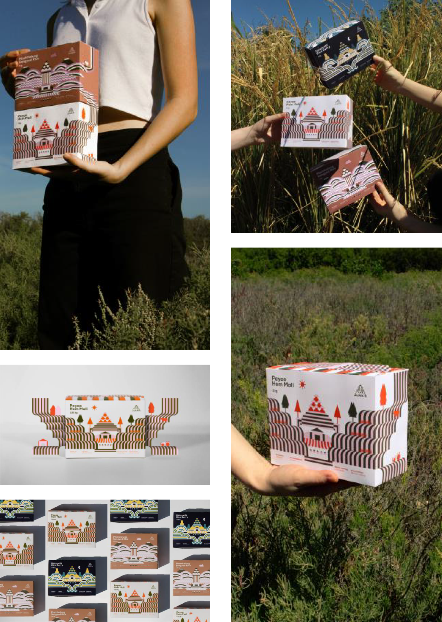
We have consulted our client to shape their Thai rice product brand named “Lukkit” that targeted to younger generations who are living and working in the city that need good quality rice to enjoy at home. The project starting from brand personality. Then we created the logo, identity system, and as well as the packaging for Lukkit Thai rice products. The concept of the logo represents the idea of family trees in a triangle composition that shows the relationship between farmers, rice farming, and rice field which eventually becomes “Lukkit” rice product.
Conclusion
–
Objectives Aims or Purposes
Most of Thai rice packaging in the market are bulky and quite heavy which is not suitable or comprehensive to all targets especially those who are living alone. Thus, some rice packaging products are not durable and the quality can turn bad easily. So we want to create a small but substantial portion packaging with variety of rice to choose from.
Process or Methods
We have suggested our clients to take the direction toward selecting the high-quality rice from various areas in Thailand which is not so popular to consumers. This way we can
Every “Seed” has its own value. It will grow, bloom or bear fruit. It may be a shelter or depend on animal and environments. Seed growth depend on preparation of cultivation and good environment. It needs good factors such as soil, water and air to stimulate seed germinate and turn seed into perfect tree. All of these factors make a seed grow, bloom or bear fruits. If it misses one of factors, seed will not grow and flourish.
“Humans” are one of seeds. If seed must have good factors to grow, human must have it too such as good relationship in family, good friendship and good social environment. They will grow up and become to quality human. But all of human are different like a seed. There are good seeds that are perfect and there are bad seeds that are not perfect. But every seed it is necessary to grow to survive and live in a way that suits them. Giving Opportunities and getting opportunities is important to grow It is one of the factors that allows us to continue to be useful and good. From inspiration aforementioned I have designed and created work through the process of thinking, analyzing, finding creative information came out in the form of a sculpture with materials that are permanence used by using stainless steel welding technique which is the main in the creation according to my idea Every “Seed” has its own value. It will grow, bloom or bear fruit.
It may be a shelter or depend on animal and environments. Seed growth depend on preparation of cultivation and good environment.It needs good factors such as soil, water and air to stimulate seed germinate and turn seed into perfect tree. All of these factors make a seed grow, bloom or bear fruits. If it misses one of factors, seed will not grow and flourish.
“Humans” are one of seeds. If seed must have good factors to grow, human must have it too such as good relationship in family, good friendship and good social environment. They will grow up and become to quality human. But all of human are different like a seed. There are good seeds that are perfect and there are bad seeds that are not perfect. But every seed it is necessary to grow to survive and live in a way that suits them.
Giving Opportunities and getting opportunities is important to grow It is one of the factors that allows us to continue to be useful and good. From inspiration aforementioned I have designed and created work through the process of thinking, analyzing, finding creative information came out in the form of a sculpture with materials that are permanence used by using stainless steel welding technique which is the main in the creation according to my idea
Conclusion
creative sculpture from the concept’s seeds growing by using the Stainless Material
Objectives Aims or Purposes
creative the Product by using the concept’s seeds growing in form of Sculpture
Process or Methods
1. Study the seed imagination 2. Idea sketch 3. Develop skate 4. Making the Model 5. Develop Model 6. Welding stainless steel. 7. Inspection the final Sculpture.
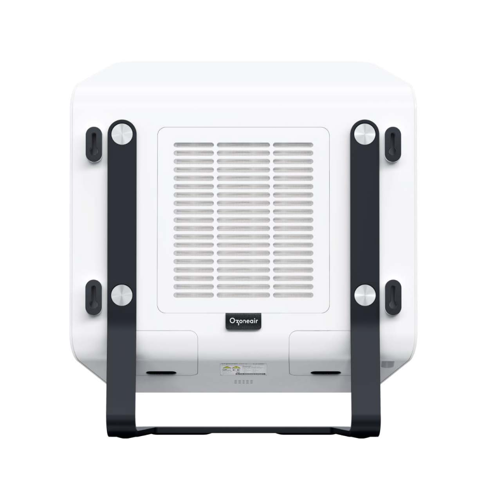
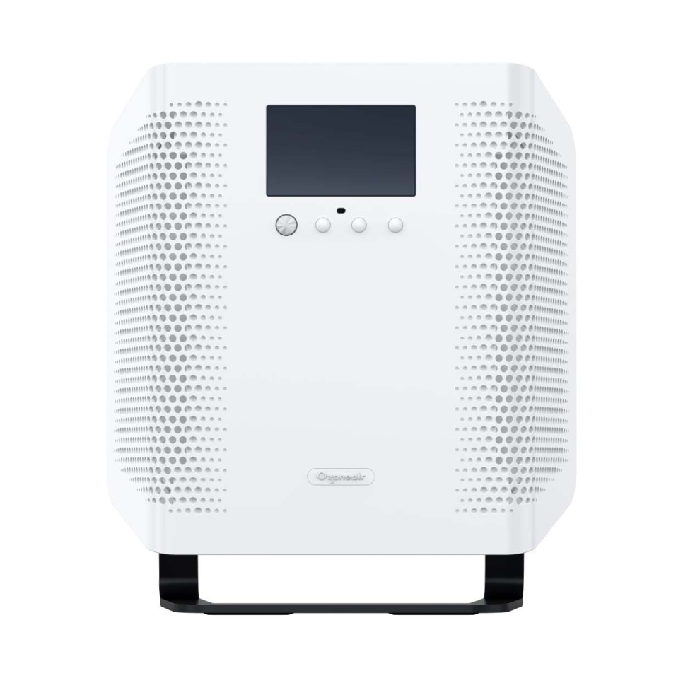
Ozoneair Purify is a unique air purifier that includes ozone technology and provides a disruptive experience in the air purifier market by offering a product with 3 cleaning modes. The regular mode operates by combining HEPA filtration with Ion technology and is aimed for home use. The ozone mode works with photocatalysis and direct radiation and is aimed at both commercial and home use. This mode is designed to clean spaces to the root of the problem by eliminating mold, bacteria, and virus accumulated in surfaces such as walls and carpets. This mode must be after the user has vacated the space as the cleaning agents are very strong. The last mode is a hybrid mode that can be used anytime and provides advanced cleaning features compared to regular air purifiers.
The minimalistic concept design provides a timeless look and feel which removes all necessary functions from the view of the user. The design is achieved without screws or mechanisms that open the compartments to the HEPA filter and UV light bulbs. In addition, the concept is made to be either standing on a counter or wall-mounted.
The product’s formal language is created according to the hardware structure which stacks HEPA filter, fan, and UV light bulbs strategically to provide only component space optimization but also the best product efficiency. The backside air intake brings the airflow through the HEPA, it is then conducted
through the side UV light bulbs of the product ad finally aired out through the front reticular output. This component disposition is designed to allow the best air purifying results.
With this in mind, we can say positively say that formal language is defined by the function of the product. Additionally, every feature from the wall mounting to the HEPA and bulb opening compartments as well as the interface which can be controlled with a minimalistic remote are aimed to provide a simple and intuitive user experience.
Last, the design was also conceptualized to align with the brand’s design language and build upon the brand’s portfolio consistently.
Conclusion
The product is timelessly designed to fit any home or commercial environment. The simplistic formal language as well as the use of only the necessary functional features gives a very neutral presence to the product which can very well blend in any space without unnecessary distractions. The product is designed to be an addition to your home or commercial space experience which provides a direct benefit to the user and goes unnoticed as another day-to-day product.
Every single detail of the product functionality including the cosmetic appearance which is led by that function is aimed to provide an intuitive, easy and simple user experience. This logical pattern is part of the understanding of the basis of product design and therefore a reflection of human conduct. As humans, our goal is to create products that make our life’s easier and this product aims to send the message across to whoever interacts with it.
Objectives Aims or Purposes
As mentioned earlier a key to the design strategy was to generate a concept that would build consistency on Ozoneair’s product portfolio and help differentiate as a consumer product with lifestyle orientation compared to the range of Clean ozone generators the brand has (https://ozoneair.se/clean/).
This new product was aimed to satisfy a totally different user persona. This profile of users seeks a product that can eradicate viruses and bacteria from a home environment on a continuous basis as well as in punctual situations. With that in mind, the product offers the functions of a regular ozone generator which fills the space with ozone and works as a deep cleaning agent as well as the functions of an air purifier which keeps the air clear consistently. The main difference between the 2 functions is that the user cannot be in the room when the product is used in ozone more vs the air purifier mode which can be left on permanently. In addition, a hybrid sterilization mode that blends both modes is available too.
Process or Methods
The cosmetic appearance of the product is aimed to satisfy both internal engineering development and user. The internal component assembly is designed to provide the most efficient results so the users can enjoy of the cleanest air. Despite the complexity of the inner structure, the concept is achieved by hiding all unnecessary functional aspects like screws and snapping or opening mechanisms. For example, the stand can be removed by snapping it out. The lightbulbs compartments also do not show any screws and the HEPA can be changed by pulling the logo tag from the backside of the product.
The product user interface design as well as all possible features are carefully created to ease the product use.
Additionally, the concept is aimed to fit in multiple environments from both the neutrality of the look and feel to the material selection which is sturdy and strong enough to stand and last in rough and commercial environments.
The design language follows the identity of the brand from the mesh patterns to the color selection to the buttons and fixation details from the stand.
The product is designed to satisfy multiple purpose. The 3 models it comes on have different capacities which serve from cleaning device for large spaces such as office spaces, retail spaces and hospitality to smaller home-use capacities. The product is designed to be able to stand alone or hang on the wall. The removable stand enhances the sophisticated values of the product and adds cosmetic value as it prominently elevates it from the floor and keeps an elegant space clearance around the main product body structure. If hanged the product can very much blend with any environment as it is provided in white and black neutral colors.
Techniques and materials
The innovation factor on this product is generated after an extensive market and technology research where we tried to identify user needs and provide a unique disruptive product in the market which could satisfy several user profiles from regular air purifier buyers to users looking for absolute clean experiences that go to the root (i.e.: user with asthma, allergies, etc) all the way to the user of commercial spaces (hotel owners, restaurants, condominiums, etc). The technological research allowed us to define the product’s technological features which are unique in its market segment. Making it the only available product that provides an air purifier and ozone generator hybrid experience.This market disruption and the extensive consumer audience that the product targets to makes it a very unique piece that can provide a solution to all looking for the latest technology in air purification.Part of the research and development process was also put up to speed during the pandemic as we could see a clear growth on the necessity of coexisting in clean air environments.
The product’s technological features are unique in its market segment. Making it the only available product that provides an air purifier and ozone generator hybrid experience. This is achieved by combining the 4 technologies below:
Photocatalysis A chemical reaction occurs where electromagnetic radiation in the ultraviolet region activates a catalyst. When the UV light activates the catalyst, it generates hydroxyl radicals which eliminate bacteria, viruses, and mold, spores, reduces volatile chemical gases, and neutralize bad odors.
HEPA filter A HEPA filter is a high-efficiency particulate absorbent air filter; it works by forcing air through a fine mesh that traps harmful particles such as pollen, pet dander, dust mites, and tobacco smoke.
Ion Ions play an important role in the atmosphere’s self-purifying processes, and by increasing the number of ions in the indoor air, one strives to create similar purifying mechanisms indoors. Small, charged particles are clumped together by electrostatic forces into larger particles. When the clustered particles no longer can be kept airborne, they fall to the floor and other horizontal surfaces and can then easily be cleaned away.
Direct radiation When airborne microorganisms pass through UV light in a specific spectrum the UV energy penetrates the outer.
The geography of the world is constantly changing. As a result, the living environment has a chance to change from the original. Different species have the ability to survive in the midst of such changes. And most of them are inherited as beings in modern times. The process of changing the genetic material of an organism’s population continues. The changes that were made will not revert back to the way they were before. Changes that continue for a long time until living things change their former characteristics. We do not see the change that is taking place. This is because the change occurs more than a person’s life expectancy. but can see the effect of such change We are now seeing more and more global changes from catastrophic events such as floods, global warming, melting polar ice, involving disruption to the current natural life, system, and balance. Many times throughout the world’s history have led to mass extinctions. Ice ages and changes in Earth’s space environment have led to their extinction. In addition, non-native species invading other territories have led to the extinction of other specific species that have Native to those regions many times But any extinction However, the cost is very high. And it will take years to regain full life again. It would be wise if we could live and progress without destroying our biosphere. extinction of many species These changing conditions had a devastating impact on the planet and on humans during its lifetime. It brings questions to human life in the past, present and future as to what human life on Earth should be. And
how many things that have been created by humans affect the change of the world? It is estimated that the world population will reach 10 billion by 2050 within the same period. Climate change is expected to cause turbulence and, in some cases, irreversible ecological changes. in this future situation Growing populations will need more fresh water, food and energy. All of which are in danger due to climate change. These are the ‘global environmental challenges’ we face, including declining air quality. ocean acidification biodiversity loss and shortages of fresh water and food. We are crossing boundaries that cannot be returned to the equilibrium of the world. This word is used to denote the present moment. Many of the important geological conditions and processes have been greatly altered by human activity, the so-called ‘Anthropocene’. The Great Challenge is a key factor governing human well-being, a sustainable environment and the security of future generations. However, these challenges are highly interconnected and cannot be resolved separately. Therefore, we need a multidisciplinary-based framework and international cooperation that allows for rapid knowledge-based and policy-making.
Conclusion
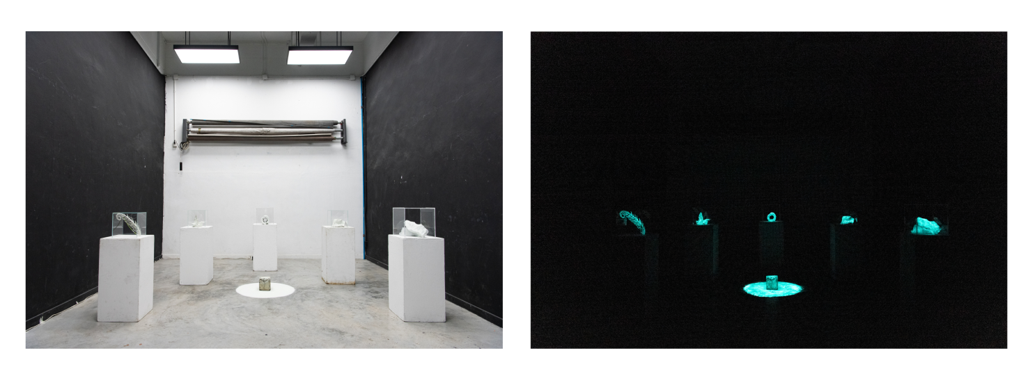
The workflow of art, from data research to synthesis in semiotics. Until the production process that finds a technique to present in accordance with the objectives of the work and can be a medium in terms of content until achieving results in the production process. In the presentation, the interaction between the audience and the work in the luminescent reactions in the exhibition space is considered and perspective is given to interpretation. In designing presentations using educational techniques can support the intended objectives.
Objectives Aims or Purposes
The aim of creating this art series is to question the direction of development and realize impact on nature in the degradation and Is it a good and correct approach? As we continue to ignore changes in the environment that may return to balance as it used to be. Problems with global climate and greenhouse conditions All have been investigated and proven to be partially human. Use of unlimited resources from the world. The creation of this work requires people to recognize them and rethink their way of life on earth.
Process or Methods
The work process begins with researching the environment and its results. In which the creation of work in the conceptual form is that the production process will select objects that are related to metaphors to natural elements to modify the context by painting white on objects to represent the action in many ways. Circumstances by human action until nature has been destroyed.
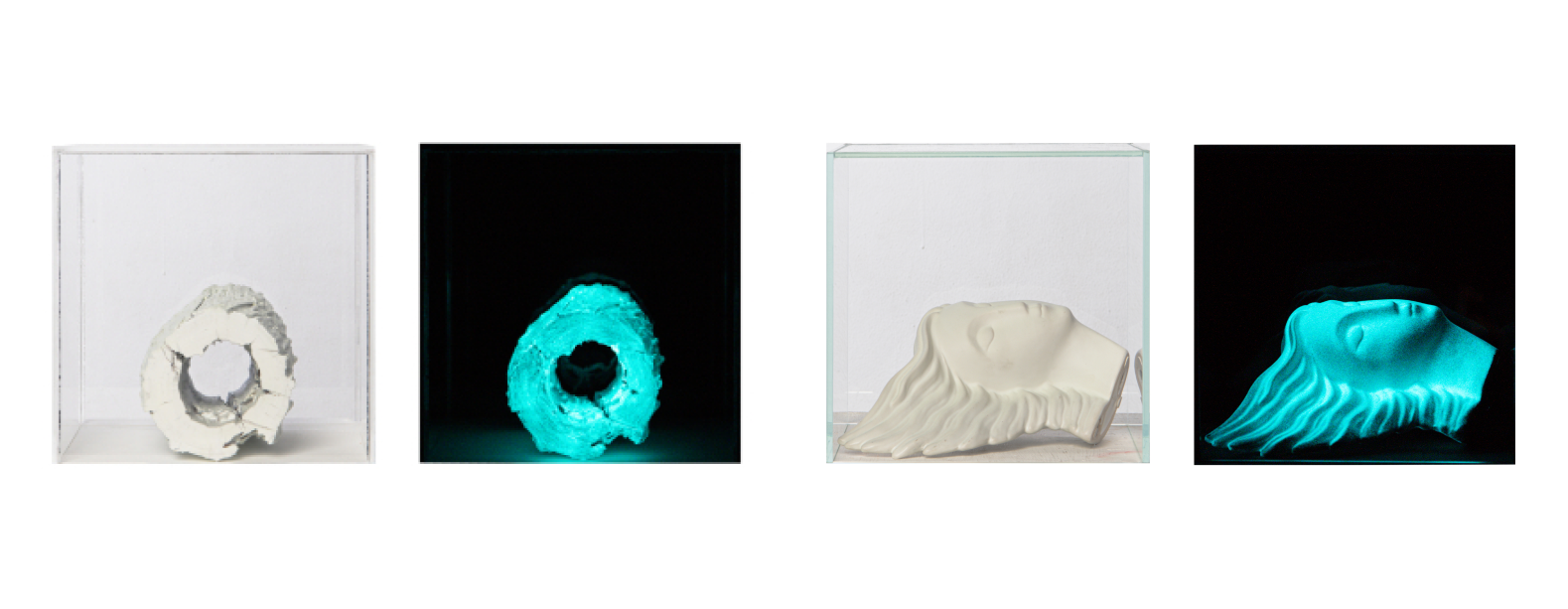
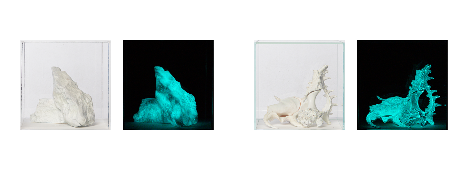
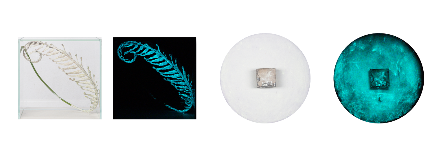
In the selection of objects, they are separated into sections, packed into a cubic box, representing the Earth’s essential constituents and representing the blockade of the atmosphere. by after painting white on various objects It uses a self-luminous fluorescent material, Strontium Aluminum is a material with good fluorescence quality. It is safe which
requires high luminescence and long life. It is a semi-permanent substance with no damage. It is UV resistant. When testing the Sunshine Weather Meter for 2,000 hours (10 years equivalent), no damage was found. Photoluminescent agents have the property of collecting light with a wavelength of 200-480nm. The wavelength range covers UV light, LED light. Photoluminescent is a substance that collects light in a bright place and emits light in the dark.
Techniques and materials
Picment Photoluminescent Painting / Mix Media / Specific Installations
Visual symbiosis: Seeing creatures in nature with the simple human eyes through a semi-abstract photograph.
Dr. Sucheep Karnasuta
Introduction
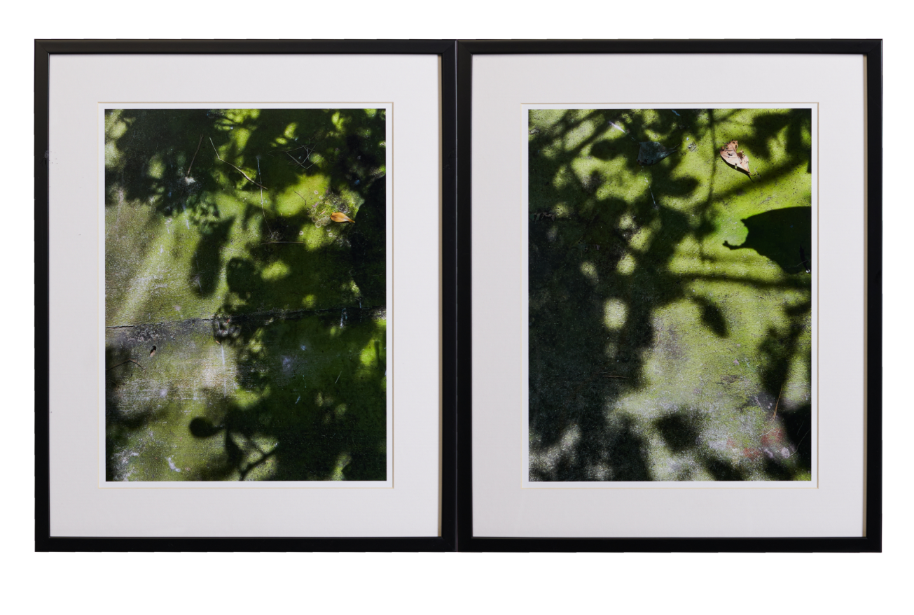
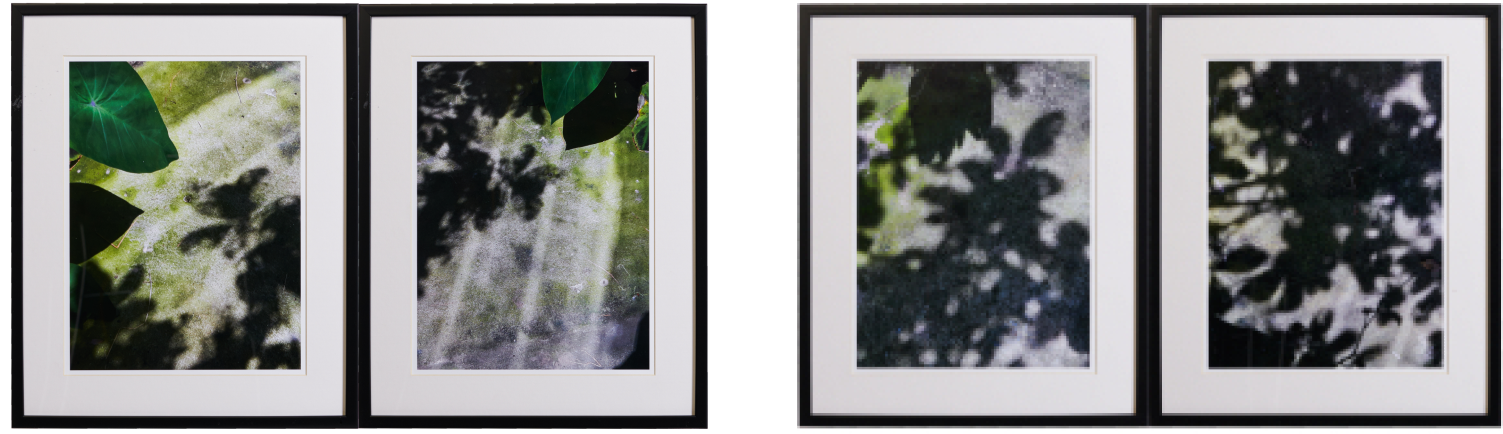
This creative work study the relationship of objects in nature in a space imitating nature, This leading to the creation of photographs that express the symbiosis of objects with a simple look and focus on looking realism at both concrete and abstract to semi-abstract in a nursery area that mimics nature to capture images using a camera mobile phone taking pictures of objects the images are then digitally printed on Luster photo paper, then displayed and install photographic works showing the relationship between 2 images as 1 work, totaling 6 works.
The resulting works are the simplicity of the attenuated state of matter in nature created by human and nature. The rough surface of concrete with the moisture of the water conducive to life to spread through the shade of large leaves under the factors of light, water, air between living things with different environments, but can coexist by interdependence under the different coarse surface of the concrete surface is conducive to the adhesion of moss under the opacity of the foliage that does not shine to the ground, it helps shade and preserve the moss plants. In addition, the relationship between objects was also seen when taking photographs of each work by combining two images together, it was found that in the same image, there were both concrete and abstract expressions from the same object in the same image, resulting in a new interpretation of the image into a semi-abstract. There was a collaboration between concrete object, background, textures, traces and shadows of the abstract objects in the two images create a close interaction with the normal human eye until they meet in the middle of the view from the left and right eye It is a view together by bringing together two images that work together. that have a mutually supportive visual symbiosis.
Conclusion
Simplicity of the attenuated state of matter in nature created by human and nature. The rough surface of the concrete with the moisture of the water conducive to life to spread through the shade of large leaves under the factors of light, water, air with the shade of leaves to moisten the moss plant pieces. It is the structure of the relationship between living things and the environment in which they live. The dense, moist leaf opacity prevents sunlight from reaching the lower ground. And also retain moisture to support each other with shade humidity and water vapor express the difference in the coarse texture of the concrete, contributing to the adhesion of moss visualize the gap area by minimizing the object to allow the workspace to express a feeling of independence is the symbiosis of two organisms to pass on meaning for further thought.
In addition, in the presentation of photographic works creator also visualized the relationship of objects. When the images of each work by combining two images together. This results in a change in perception by transcending the way of thinking. and limitations in looking at concrete and abstract forms was found that in the same picture there were both concrete and abstract objects from the same object in the same picture. This results in a new interpretation of images into semi-abstract by the interaction between concrete objects and backgrounds, textures, semi-abstract traces. and shadows of abstract objects to the interaction of visual relationships as a result of viewing images with a close look at the eyes of ordinary people. There was a meeting in the middle between looking from the left and right eyes to see together by bringing together 2 images that work together between objects, content, surfaces that are mutually supportive.
Objectives Aims or Purposes
To study the relationship of objects in nature in a space imitating nature, This leading to the creation of photographs that express the symbiosis of objects with a simple look and focus on looking realism at both concrete and abstract to semi-abstract.
Process or Methods
Seeing comes before words. The child looks and recognizes before it can speak. (John Berger,2008)
Photos and memories are as certain as they are today. So what we see on paper is certain, it seems as though we are truly touched or involved in the event. An indication of a photograph in and of itself with the idea that other people can talk about photos but not the real photos. Photographs become invisible. and we cannot see or truly understand it photograph must therefore be described in the subject matter. The specific context of it because the subject in the photographs realized in a specific moment in times. The photograph confirms that the subject is frozen for a period of time (Freezing a Subject in Times) and that the subject suddenly exists in the past. photo questions which is like bringing the past to the present and freezing the principal under the times of the past with the expression of what appears in the picture is still being preserved. Just like studying myths, we need to read the picture by looking at it at 2 levels. The first level is to look at the visual elements of the picture or the language that appears in the picture that will make it easier for us to read the picture? It clearly reflects the direct meaning denotation with the mythological reading that will reveal something that is obscured by the implied meaning. connotation. (Suddan Wisuthilak, 2018)
Photographs may contain elements that emphasize mystify in the sense that they are more difficult to interpret than direct communication. We may have to rely on both concepts. cultural understanding and historical context to help interpret the conceptual code hidden in the picture. At the same time, the photos are simple and clearly in communication (Clarify) may hide the complexity more ingeniously. consideration to see something or many things in a photograph, there is an element of training in order to have an eye with the photographer. On the other hand, viewers can also consider images by using their own eyes together with the eyes of others for consideration as well. with collective eyes, the meaning of seeing or perception of the world through the eyes therefore It has the nature of letting ideals, beliefs, and rules and powers flow into our bodies through vision. Transferring the spontaneity of photographs of friends leads to an understanding of another culture. So it’s never that simple. or according to the aspirations of photography from the beginning on the other hand, it was the natural expression or the impression that there was no camera for the people in the field that matter. Because that might make sense that a photographer or anthropologist is being spoiled by having others look at them more than the camera Indeed, photographs with a natural appearance It is a sense of urgency to intervene and challenge the legitimate authority of anthropologists to collect information and present stories. In other words, it is Those natural photographs are the presentation of their self-awareness to anthropologists. Anthropologist interested in the history of anthropological photography like Elizabeth Edwards said that the picture looked unreal. or not natural It reflects what the anthropological nature of nature is like. Therefore, the natural character of the photographs is of vital importance to the legitimacy of the visual anthropological work under this concept. (Sorayut Aiemueayut, 2018)
Human beings are dependent on the environment and the environment. The most well-known symbiotic relationships are animals and plants grown by farmers. Humans have many other biological beings, relationships that support and sustain our lives as well. Increasing numbers of people are beginning to realize that it will be of great help to humanity for all other living things on our planet. If we can improve these symbiotic relationships Humans live in close interdependent relationships with many other living things. When various beings coexist with one or both of the benefits, this is called symbiosis or Mutualism. The inseparable relationship leads to a shift in perspective from composition to holistic. It is thought from the perspective of relationships. Considered to move the focus from the object to the relationship that is linked to each other. (Fritjof Capra, 2013) to convey their understanding of weaving and interdependence A new scientific understanding of the systems of life conveyed through the depths of ecology. It is a difficult task to debug that will lead to an understanding that requires a lot of judgment on the face of life. It is a challenge of the need to learn, recognize and pursue the magic of work until it becomes something that we must eventually understand. and it must be regarded as the future of the wisdom of the open self. and moving in the depths that are always connected to the oneness that arises with the world in the name of life. (Fritjof Capra,2010)
From the above concept creator have selected and applied only some of them. To lead to the creation of works that begin with an interest in plants that are naturally beautiful so began to watch and question the change in the timing of the withered leaves showing incomplete dentition, that most people tend to overlook the beauty and do not see the value of things that have changed. But creator have the idea and feel that things are beautiful in their time. Therefore, I want to convey that feeling according to the feeling and experience of looking at things that reduce everything naturally, let everything go by itself. Whether deciding on a place, area, or object by looking for objects in the simplest and unconditional way by choosing the most common places where living things, space, time, and the relationship of things that support and support each other is chosen. Filter until the difference is left in the opposite pole is living between plants and concrete under the moisture generated by water the dependence of nature in the area of moss living in the shadow of the leaves of plants, starting from looking at the realistic reality that is conveyed with its unique shapes and colors, it creates a feeling of fun, enjoyment, and then slowly relaxes from the concrete to the abstract. until the relaxation occurred throughout the period of creation of more and more works respectively. Then began to gradually reduce the content of the object. until able to connect realistic and non-realistic patterns that can express the relationship of looking at both concrete and abstract objects in the same picture between the leaf and the shadow of the leaf to find simplicity, man-made objects in nature, together with nature, between concrete floors and plants and the moisture of sapling plants to create concrete realism. and abstract within a single image as well as minimizing objects to allow space and objects to function until they can express a feeling of symbiosis, referring to the mutual benefit of living things and objects. The biggest difference is the concrete floor.
Techniques and materials
To study the relationship of objects in nature in a space imitating nature, This leading to the creation of photographs that express the symbiosis of objects with a simple look and focus on looking realism at both concrete and abstract to semi-abstract.
Size or Mins.
During this time of pandemic COVID19, one of the things to help maintain my spirit and keep me alive is plantation and Botanic. Through the process, I was stunned by the massive forms of flowers with their vivid color. The flowers are a powerful effect on the mood. The colors will trigger our emotions. With a variety of types and species, I create visual art by simply applying the mirror effect. Carefully placed animated images with the movement, colors, and transition to go along with the abstract sound that evokes the mood and feeling of mesmerized and mystery.