Categories
Clean design

The Illustration book design project for “Lok Klom Klom Tee Riak Wa Digital” (Digital literacy guide for parents and children). The research paper project supported by Thai Media Fund organization, Thailand.

The Illustration book design project for “Lok Klom Klom Tee Riak Wa Digital” (Digital literacy
guide for parents and children).
The research paper project supported by Thai Media Fund
organization, Thailand.

Assistant Professor Dr. Sirada Vaiyavatjamai

Introduction

The research study by Asst.Prof. Chawaporn Thammanitayakul, Ph.D. supported by Thai
Media Fund organization in Thailand was found that many digital natives or younger
generations today are suffering from cybersecurity issue. The study shown most of them are
in lower middle-class families and have inadequate digital literacy knowledge. They are
unable to deal with a digital problem and struggle to overcome with their parents. Raising
awareness of this issue was concerned, the researcher analyzed and digested information in
order to encourage intended parents and their digital natives’ children to obtain digital
literacy. To motivate audiences and create an effective media is focused on visual
communication design principles. The imaginative illustration and infographics can enhance
words/information and improve accessibility for audiences. Furthermore, applying a
storytelling technique can convey the message visually and easy to related a relevant
situation for audiences.

A design research process for this project was defined into five steps including; 1) design
Brief 2) concept development 3) Implementation 4) audiences testing and 5) preparation for
publication. The survey results of focus group discussion investigated that the use of
illustration with characters design and infographic element as a storytelling to engage
audiences, evoke emotions, and enhance learning experiences. The combination of
complementary color is considered to grab attention on audience testing process. The
illustration conveyed the concept design of ‘Step inside’ which related to the meaning of
stepping into the digital world and stepping into children’s mind. The effect of mentally
problem is concerned in what happen to our children. Consequently, an appropriate
illustration style is able to motivate target audiences and deliver a message of a particular
content understandably. The accomplishment of the project was determined to be a case
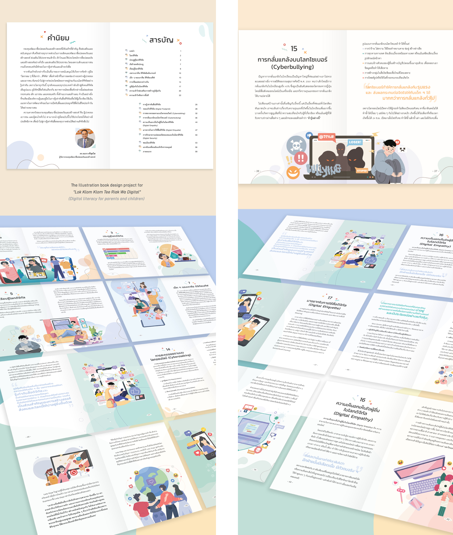
study for a visual communication design project for media approach. The book contains 70
pages both printed and digital flip book version throughout the online platform for an easy
accessibility.

Conclusion

The completed artwork was determined by the project’s committee members that the
illustration style can enhance information and improve the message effectively. The illustration
can motivate target audience to access the book, driven a meaningful and imaginative style
with the storytelling method. The book was printing in 5,000 free copied with an e-book version
available to easy access for a digital lifestyle.

By doing the process research of five steps;

1) design brief 2) concept development 3)
Implementation 4) audience testing and 5) preparation for printing were useful and impact
audiences to improve accessibility.

The illustration offers a mood or emotion of happiness,
appeal, charm and expression of human touch. It can simulate and strengthening the
message delivered to audience. The graphic identity and infographic style applied in this
project are created uniqueness with clean and simple form. It can help audiences with their
understanding of words as well as useful for readers with learning difficulties to obtain a
content precisely.

Objectives Aims or Purposes

The purpose of the Illustration book design project is to express knowledge and raise
awareness of digital literacy to parents and their children. Amongst the increasing online use rate of all generations, particularly in younger generation. There are many concerning issues on the digital activities that influences and effects our children’s developing behavior and wellbeing of digital experiences for their lives. Furthermore, understanding the knowledge about digital literacy can increase positive communication and strengthen a relationship between parents and children in a family.

The beneficial of illustration and infographic can convey an idea in a very clear and simple way to parents and younger generation. The content of the writing can be enhanced by motivated infographic and friendly character style. The book published in two version; printing version in a book targeted to communicate with parents and e-book online version aimed to approach to younger generation. The Illustration could help explain and clarify complicated content to create interest in a new topic and it hold people’s attention spans.

Process or Methods

The Illustration book design project for “Lok Klom Klom Tee Riak Wa Digital” (Digital
literacy guide for parents and their children) presented the concept of ‘Step inside’ with friendly, simple and clean design. The design work involved in five steps of the process as the following;

  1. Design Brief – A representative of the writer team, Asst.Prof. Chawaporn
    Thammanitayakul.Ph.D. briefed the purpose of the book project including intended target
    audiences, a review of strategic approach to communicate the content. This process is a key to defining the opportunities and limitations which are equally important in discovering the best solution. (Skolos, N. & Wedell, T., 2012)
    1. Analyze what target audience know about the topic, their familiarity with reading
      text and their ability to interpret data and information.
    2. Define the message what is the key message that the book should convey with
      attractive illustration and infographics.
    3. Define data and emphasize key message to enhance an understanding of the
      information.
  2. Concept development – Focus on the direction and understanding of the key message.
    1. Literature review on concept and design principles, layout design, color theory
      and communication strategies.
    2. Analyze the information from Asst.Prof. Chawaporn Thammanitayakul.Ph.D.
      on a result survey of target audience’s background and determine a method to express
      the message effectively.
    3. Research on an appealing visual communication style to attract intended target
      audience.
    4. Focus on the appropriate direction and do the design research on a selected
      concept.
  3. Implementation – Process on a design development.
    1. Sketch the Idea start with simple drawings on a paper.
    2. Define composition of character style, graphic elements and build a narrative
      message.
    3. Define color scheme from the research on color phycology to create mood/tone
      and enhance the message of the illustration. The use of a complementary color can grab an
      attention and a lighter-pastel tone considered optimistic, happy and uplifting effect on
      audience’s mood. (Gremillian, A., 2019)
    4. Develop main characters and infographic on a book cover design as well as all
      chapter cover using computer generated in Adobe Illustrator program.
  4. Audience testing – Conduct a focus group interview of middle-class parent
    1.  Collect Feedback from the focus group interview including character design, color
      scheme, infographics, graphic elements, sample of layout design and the understanding of
      message.
    2. Improve the illustration and infographics from the feedbacks
    3. Layout all the content including illustration, infographic, graphic elements and
      texts before proofreading and check all revisions and corrections.
    4. Obtain a final proof from the committee of the project.
  5. Preparation for printing – Publishing process
    1. Assure all images and fonts are precisely present before export all files.
    2. Submit files and check for prepress that meet specifications and publishing.
    3. Create html 5 eBook by web developer.

Techniques and materials

In this project, the extended structure requires pattern making techniques, including pattern enlarging, pattern dissection and alteration. The complicated structure also requires various sewing techniques, such as the use of fusible interfacing to reinforce the extended structure, the use of enclosed seam, traditional tailoring techniques, basting stitches, padding and hand-sewing.

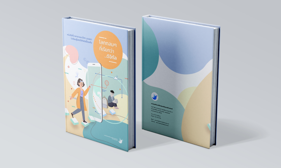
The Illustration was started from a cover design with character design and graphic symbol of cyber/digital world to represent the concept ‘Step inside’. The concept related to a key message inviting parents to step inside the cyber world whilst realizing what their child might
be encountered. The cover design presented a friendly mother character in the front and
grayscale son character, holding electronic device and sitting from the distance with a giant smartphone in the middle between them. The illustration implied through a storytelling that an ignorance of cybersecurity may be a factor to separate apart parent and child. The use of storytelling can engage audiences, evoke emotions, and enhance learning. An audience will experience and recall the events of the story in a personal way and it becomes a part of them. (Lidwell, W., 2015)

About the book cover design appeared a generous mother in warm color outfit to convey full of positive energy to the audience. The Mother character was stepping naturally on keys of a computer keyboard direct to her son through a giant smartphone. The son, in grayscale was sitting on the floor and looking at his electronic device’s screen which communicate that a child may be left out or struggling on a cyber /digital world caused by an unsecure problem. The graphic elements including abstract shapes, cyber symbols and mathematics symbols laid down in a clean background were simplified a ready-to-learn new skill. The color of
illustration was given bright and cheerful feeling transferred a pleasant atmosphere to motivate parent to learn an essential digital literacy together with their child.

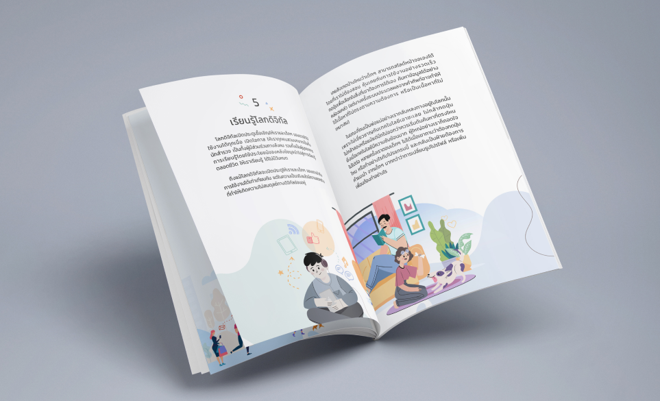
The illustration in the book carry on the storytelling with infographic explanation from
chapter one to chapter twenty consistently. In a chapter ten to twenty, the ‘son’ character was
changed to colorful represented a strengthen up feeling reflecting audience gaining more
knowledges of a content throughout the book.

The illustration design was developed from a sketchbook and applied selected color
scheme in Adobe Illustrator. Finally, the illustration of a book cover and all main cover chapters
were developed and layout with texts and add more infographics appropriately.

Size or Mins.

The Pocket book size: 210 mm x 148 mm


Download

Categories
Clean design

Barrier

Barrier

Mr. Seksarit Thanaprasittikul

Introduction

        Since the outbreak of the coronavirus has widely affected people’s lives, protection has been a major concern. Protective kits or devices have become an essential item in daily life. After observing how people protect themselves during the pandemic, it shows that wearing a mask is the most common method. It not only provides physical covering but also abstractly creates intangible protection for the wearer. Such intangibility involves the assurance of increasing protectiveness, provided by wearing a mask, and the idea of an extra protective barrier for the wearer. Considering the intangibility described previously, the term “barrier” becomes the keyword that can visualize intangible protection in the fashion context. To reinterpret the idea, the design process highlights the way to create clothing as a barrier. Based on a study of clothing construction and protective garments such as armor, the barrier is translated into an extended structure on the clothing. An extra layer extended from each panel of the base garment portrays the barrier of intangible protection around the body. Silhouette designs derive from the experiment with the extension of each garment construction by integrating an extended structure into each panel of the base garment. Materials include plain stripe cotton and twill cotton, fused with fusible interfacing to reinforce the extended structure. As a result, the design features a garment with two layers, including the base garment and the extended structure that creates the protective barrier, reflecting the intangible protection.

Conclusion

        In conclusion, the project is a visualization of the intangible protection that emerged during the pandemic. To reinterpret the idea, the design process highlights the way to create clothing as a barrier within the fashion context. The experimental approach allows new possibilities in the design process. Unlike working on visual interpretation, the process focuses on the reinterpretation of the conceptual idea into 3-dimensional experimentation, featuring an integration of the extended structure into the construction of the garment. The design features a garment with two layers, including the base garment and the extended structure that creates the protective barrier that portrays the intangible protection. As a result, it creates a new design with unusual shapes, forms, and construction.

Objectives Aims or Purposes

– To explore new possibilities in fashion design through experimental approaches to creating a new design in shapes, forms, and constructions.

– To investigate the role of clothing from a different perspective.

– To advance professional expertise in design and to expand design skills.

Process or Methods

          Based on a study of clothing construction and protective garment, such as armor, the design process starts from the experiment with clothing structure. In response to the idea of “clothing as a barrier”, the experiment focuses on the extension of each garment construction panel. After various experiments, ranging from folding, enlarging to pattern dissecting, the extended structure can be achieved by the additional raised structure, inserted in between the base construction and the extended panels. As a result, the design features a garment with two layers, including the base garment and the extended structure that creates the protective barrier that portrays the intangible protection.

Techniques and materials

          In this project, the extended structure requires pattern making techniques, including pattern enlarging, pattern dissection and alteration. The complicated structure also requires various sewing techniques, such as the use of fusible interfacing to reinforce the extended structure, the use of enclosed seam, traditional tailoring techniques, basting stitches, padding and hand-sewing.

          Materials include plain stripe cotton and twill cotton, fused with fusible interfacing to reinforce the extended structure. Different types of fusible interfacings are used on different parts of the structure. The stiffest type is used on the raised structure inserted in between the two layers, while the medium and lightweight interfacings are used on the extended structure.

Size or Mins.


Download

Categories
Clean design

Children of Water

Children of Water

Assist. Prof. Samuel Raymond Forkner

Introduction

Motion-pictures in the visual arts
Non-fiction films use well-worn, and proven, artistic methods for their delivery just like make-believe films do. Sculpted for the viewer’s ‘enjoyment,’ these techniques are really objective in nature as they are passed down from teacher to student, or pioneered by individuals over time. In the field of the visual arts, these methodologies can sometimes be thought of as a particular format for a visual work (such as a documentary or music video). These formats have parallels in art history, such as movements or schools of thought

(like a post-impressionist painting or an Avalokitesvara Buddha image). Artistic methodologies utilize techniques to create an illusion of reality, they make inanimate objects come to life, they spark the imagination and keep it going for the duration. Thinking visually occurs in a different part of the brain than say reading or logic, and by viewing something that seems real the participant is rewarded with a revelation (a new understanding) about a situation they might not otherwise have been able to be a part of. This is how make-believe works for fiction films, as well as documentaries from hard to reach locations. The main goal of art is to create an image, for the purposes of viewing. We must always be finding ways of integrating new viewing technologies with these methodologies because cameras and the industry are constantly changing. Videographers always try for cinematic looks, even when they are photographing events in real time which aren’t staged. They frame, focus and expose to create a type of shot. It is a tradition since the very start of motion-picture cinematography, such as the Kinos. Thus, non-fiction films still create an illusion of reality. However, in documentary production it is assumed that the information is going to be successfully received by an audience member. Even if that illusion is that it is all real, they will see it as the truth of life.

Conclusion

Documentaries profess themselves as being pure representations of the truth because they record something that really happens. The effect of raw footage, or video captured in a journalistic setting, gives the viewer a sense that what they are seeing is real. Live video has an authenticness due to the spontaneity of its capture. Guerrilla-style shooting works very well for live recording. In fact, during the shooting of this documentary, it had already been 10 years since Michael Moore made his groundbreaking work “Roger and Me” where his three person crew ran around capturing fleeting moments of revelation. And it would be only three more years before he would win an Academy Award for making “Bowling for Columbine,” giving documentaries the biggest boost in public consciousness since the 1970s. This form of freestyle, independent cinema was academically described in the Guerrilla Film Makers Handbook in 1996.

Shooting documentaries guerrilla-style might seem to be a journalist’s approach to capturing video footage. But that doesn’t mean artistic principles will take a back seat, quite the contrary. Capturing cinematic, movie-like shots of live events is a skill of which the Kinos prided themselves back in the 1920s with their newsreels. And all the way through the late 1900s with news television camera-operators, up until the present day with high definition video available on mobile devices, the influence of these “truths of life” is what helps a narrative to stick in the public consciousness. Much like playing a solo in a musical ensemble, cinematographers are always waiting for the right moment to capture an epic shot. With the goal to record striking images, there is also the artistic intent needed to shape up and edit the footage together with an overall structure, show the character of a particular location, or tell part of a story along with also being informative. For the camera operator to be a one person crew, makes him or her the director as well. Artistic considerations overwhelm all others during the capturing of imagery and they must do it all in real time without any second takes. Using lessons from observational cinema and ethnological film, a filmmaker should try to remove any trace of himself from the movie, an impossible task when he is a strange foreigner in the deep villages of Bangladesh. Similarly and in parallel, the filmmaker’s subject is trying not to artificially influence his environment during observations to maintain his own scientific objectivity. The appropriateness of guerrilla-style filmmaking could not be more welcoming in a situation where a tiny,

yet powerful camera can grab kino style clips for documenting something important while it is happening, in the moment, without the possibility of staging scenes or rehearsing. Documentaries typically reveal content unknown to the public in this way. This style has been appropriated by modern broadcast television in the form of reality TV. And no doubt will take on other forms in the future. Here I use it with purpose to showcase what I learned in those very special four months from July to October in 1999.

Art can serve society by educating a general audience. Artisans can collaborate with doctors from their fields of science and help them reach out to the public, inspire, educate and heal. Even now in the field of visual arts there are gray areas regarding the correct pigeon hole for where to place video. Is its texture even capable of being fine art? Is video-art strong enough to hold its own at an exhibition, or does it need to be part of an installation to be interesting? Can informational or educational videos be themselves a work of art, or would this just be the same as documenting an artistic production where the camera is only a recorder? Does having pre-disposed content reduce one’s ability to use an artistic methodology? Questions like these tend to suggest that techniques from the field of visual arts must be subservient, out of necessity, to collaborate within another field. It is almost as if saying art is doomed to be bonded to a utilitarian purpose forever. However in the context of the film industry, its constantly changing technology and therefore its means of distribution, a collaboration that forces a particular type of structure or working style upon the artistic method is simply just an issue of formatting. The philosophy of capturing the images comes from a tradition dating back to the very origins of film and cinematography. Likewise this work has been repackaged to be distributed in a much different technology than the camera itself was designed for.

Process or Methods

In the villages I tried to shoot in an observational style like from the philosophy of direct cinema or ethnographic film from the 1960s. I tried not to interfere with the environment around me by moving things around or asking people to do things. Instead I let the camera roll in the hopes of capturing a special moment. It is, however, impossible not to influence your surroundings. The observer influences the system simply by being there, and we were there for four months. But the people got used to us on a certain level. Still, kids would run up in front of the camera on purpose, every single time. Excited, they would jump around. But the philosophy of shooting didn’t change and I tried to keep the camera out of everyone’s mind whenever it was possible.

The structure of the edited footage was planned in ordered sequences:

  1. Tonal montage, introductory sequence and title segment
  2. Information sequence 1, authoritative source, interview with Dr. Thameed
  3. Rhythmic montage, travelogue
  4. Information sequence 2, training with the field workers
  5. Metric montage, severity
  6. Information sequence 3, What are we finding?
  7. Overtonal montage, food montage

The introduction is a tonal montage with long superimpositions based on the line of a figure or the space and volume of a shot. It contains the title and tries to create a sense of place, a place on the water with primitive technology.
The interview with Dr. Thameed is cut in an A-roll/B-roll style. He relays information to the viewer in a well explained order. He nicely sums up the main issues which make up the brunt of the problem: immunity, infections and the cycle which causes malnutrition, rehabilitation and recommendations, vitamin supplementation.

The next segment is a sequence cut according to the motion within each shot. It is what Sergei Eisenstein called a rhythmic montage because the motion of the subject within a particular shot creates a visual rhythm from left to right, up and down, or in and out. As the ghost ride from the perspective of being on a boat moves you across the screen, I cut back and forth between country and city scenes to make a contrast between their lifestyles in a mit-out sound (MOS) travelogue.

The training of the field workers was shot out in the field, So I tried to use an observational style, such as an old ethnographical film where the camera tries to hide in the corner like a fly on the wall. But the search for objective truthfulness, such as the pravada of the Kinos, comes more from a direct cinema approach. Letting the camera roll constantly, I captured what was happening at the moment. I knew the footage would be extensively edited with the purpose of taking advantage of the large ratio of footage to final piece length.

The information should come out when cutting the footage together, especially if I was to cut according to what was there in the frame, rather than any preconceived notion of how the documentary should be. I wanted to cut the footage together the way that the footage itself wanted to come together. While I was shooting, I made sure to frame many different picture sizes and camera angles.

The third informational segment is edited with the same ideas as the second informational segment and it segues into an overtonal montage.

By combining footage of different recipes being prepared, I created an associative connection between related events. The viewer will connect the information in each successive shot and draw conclusions about how these people live and survive.

Techniques and materials

In the 1960s, direct cinema was made possible by the invention of light weight cameras and advances in sound technology which reduced the number of people needed to make up a film crew. Likewise, in the last years of the 1990s, digital video made this technology even smaller and more affordable. I instantly became a one-man crew just in time to do my thesis. At the time this footage was shot, cameras could not yet record to a disc or a hard drive. Although that technology would arrive quickly after the turn of the millennium and start the age of the infinite reel, which we are in now. I had to carry mini-DV cassettes with me that I put in a Tupperware container to keep dry. I had enough money left over after the purchase of my Canon Optura camera to buy 40 one-hour tapes, and I had a battery which would last for 6 hours but had to be worn on your belt and connected to the camera with an obtrusive wire.

It was a guerrilla-style production in many aspects. I had a very small budget of $2,600 which included the camera, batteries, and a roundtrip plane ticket. My financial concerns would always come last to the organizations I was helping, because funding for non-profit organizations that do necessary work, never have any budget left over for art projects. Nevertheless, I knew that this subject would make a great documentary.

And I hitched a ride wherever I could. The people within the organization were very helpful, and I was taken to many sites outside of the scope of my friend’s particular research project. They taught me about their work and their methodology. I met a lot of inspiring people.

Shooting in this environment was a challenge, but riding in pole driven boats made each shot like a dolly move, or a ghost ride. I approached shooting the same way that I approached playing a musical instrument. I had practiced my rudiments such as framing, capturing with a manual focus and exposure, and how to hold a steady shot. I would record as many nature shots and beauty shots as I could. I also had a lapel microphone which I put upside down in a cooking wok so I could have a parabolic microphone like the ones used in sport stadiums. I put a hand strap on it so that with my left hand I could point it at the subject and get good sound out in the field. I held the camera in my other hand and used the neck strap to keep it steady. I had to have a way to pack it up quickly when it started raining or I needed to get in and out of the boat.

Since this video was shot editing technology has gotten a lot better. Non-linear editing has become the standard for video editing and personal computers have become much more powerful. Modern computers, however, can no longer connect to video tape decks and many now do not even read DVD discs.

For the sequence in the villages, I cut in the style of continuity, using techniques like match on action, reverse angles, cut-aways and inserts, and changing picture sizes from close-ups to long shots. When shots like these are cut together they preserve the illusion that this sequence of shots happened in continuous time, in actuality they were separated by minutes. The editing philosophy relies heavily on montage theory as well. I use montages to separate informational segments which can tire the viewer, to give some breathing room and time for contemplation. I employed a tonal montage for a typical opening sequence, a rhythmic montage to compare the rural area with the bustling city of Dhaka, a metric montage to add a sense of urgency, and finally an overtonal montage to express the magnitude of the villagers situation, to pose the question “what do we eat and why?”

Size or Mins.

1200PxX1200Px-


Download

Categories
Clean design

Mudmee pattern design inspired by folk tales of the northeastern region:Phaya Kan Khak

Mudmee pattern design inspired by folk tales of the northeastern region:
Phaya Kan Khak

Pongpinij Pinijdam

Introduction

Mudmee pattern design Inspired by folk tales of the Northeast The story of Phaya Kan
Khak The objective of this study was to study the design process of Mudmee cloth patterns
and to design Mudmee fabric patterns Inspired by folk tales of the Northeast The story of Phaya Kan Khak. The results of the study found that Most of the motifs of Mudmee cloth are caused by lifestyles related to nature, beliefs, and some patterns appear in various

arts such as wall paintings or architecture appliances Patterns in folk legends or literature. The naming of patterns has been established since ancient times. or re-name the pattern according to the
designer’s imagination. Most of the Mudmee fabric patterns are patterned throughout. It is a pattern that is arranged repeatedly. Continuous throughout the canvas Fabric patterns that are popularly used to design 4 patterns are straight stripes or torn stripes, zigzag stripes, rhombus patterns. or a cross and the pattern is curled into a circle like a spiral or a hook by the creators have designed the Mudmee fabric pattern. That brings inspiration from folk tales in the Northeast The story of Phaya Khak Khak came up again. by using a graph written in a computer program. In this regard, the new pattern of Mudmee cloth can be extended to create various products and also helps to promote and conserve local wisdom as well.

Conclusion

Identity present the distinctive features of the area Identity of society, community and
way of life Culture, presenting beliefs local values, traditions Creative economy Bringing the concept of creative economy as a design concept to connect with culture to create added value for the community’s economy Sustainability Apply sustainability concepts to create careers income prosperity sustainable preservation and restoration of natural resource bases

Objectives Aims or Purposes

  1. To study the design process of Mudmee cloth pattern.
  2. To design a Mudmee fabric pattern Inspired by folk tales of the Northeast The story of
    Phaya Kan Khak

Process or Methods

  1. Study the folk tales of the Isan region. The story of the King to analyze and find ideas for creating works to have a connection with the story.
  2. Study the patterns of Mudmee cloth patterns of the Isan people. To analyze the pattern design guidelines to be consistent with the production process.
  3. The creative process with drafts by using graphs to write in a computer program will assign 1 slot on the graph paper to be equal to 1 Mudmee pattern in order to see the structure of the pattern to be connected to the story as follows.
  4. The process of stitching 1 piece of Mudmee fabric by using a graph to write in a computer program. Will assign 1 space on the graph paper to 1 space on the graph paper equal to 1 Mudmee pattern to see the structure of the pattern connected with the narrative.
  5. Color determination process using indigo as the main color that is natural color to comply with the production process and related to the way of life of the Isan people.

Techniques and materials

Digital Graphic

Size or Mins.

420 x 594 mm

Phaya Kan Khak pattern
The pattern of the family of Phaya Khankhak
rain pattern
rice field pattern


Download

Categories
Clean design

Monsters of the Sea

“>”>Monsters of the Sea

“>”>Miss. Ploy Nikadanont

Introduction

Microplastics, according to study, circulate throughout our bodies and may become lodged in organs. Although there is no information on how it affects our health, researchers are
concerned since microplastics have been shown to harm human cells in the laboratory and air
pollution particles have been shown to enter the body and cause millions of deaths each year.
How can we solve this problem since humans depend on plastic for livelihood and
convenience. It is, however, suffocating the earth, the animals, and ourselves. When plastics
are used and discarded, they breakdown into particles known as microplastics. Microplastic is
now found in virtually every part of our life, including the air we breathe, the food we eat, the
water we drink, and even in our own blood. The majority of microplastic particles found in
human blood are PET plastic, which is commonly used in beverage containers, and
polystyrene, which is regularly used in food packaging.

The discovery of Microplastics in human’s blood reminds me of the famous quote by Jean
Anthelme Brillat-Savarin (1755-1826) “Tell me what you eat, and I will tell you who you are”…
What kind of creature are we if we consume animals and vegetables that have been tainted
with microplastic? This was the inspiration for creating “Monsters” project, which uses food
packaging to create printing plates to illustrate how those packaging contaminates plants and
animals which are our food and gradually impacts our life. The first series of Monsters is
“Monster of the sea” which consists of three pieces of prints that depict marine life that has
been impacted by microplastic contamination. The printing method was chosen for this project
because it is one of the most toxic techniques and able to produce textures that symbolize
pollution. Additionally, because it is repeatable, it helps depict our unchanging behavior that
contributes to environmental difficulties today. Along with the traditional printing process, this
project also utilizes augmented reality (AR) to narrate story through moving image and sound.

According to the project’s objectives, which include recycling food packaging, exploring new
possibilities of aesthetic expression through traditional printmaking and digital techniques, and
raising awareness about environmental issues focus on microplastic pollution, the result will be
analyzed by using a SWOT analysis below:

In summary, to use tetra pak as a printing plate cannot develop an efficient recycling system and have the possibility to produce non-recycle garbage which provides a lot of carbon footprint during the termination process. However, it can help cut down the chemical process of the etching technique that needs to use acid to bite the copper plate.

In terms of aesthetic pleasing, tetra pak print provides a unique texture and look with folded lines on the printing plate. However, these lines could challenge the artist to work on composition, and could distract the eyes of the audiences. Combining traditional printmaking techniques with AR technology can help with communication, as moving images help in conveying the message. The mixed techniques also help provide opportunities to bring traditional to the digital market. But, in the area of traditional printmaking, this might not be the ideal and could affect the value of the artwork.

A topic of microplastic pollution has the potential to be used as a design concept and discuss
topics for brainstorming in classes like ICCD210 CD Studio and ICCD103 Research Studio.
Also the student might be interested in this topic since Generation Z is more concerned about
environmental issues than other generations. However, it might be too complicated and require
reading a lot of academic research. According to the survey conducted in Mahidol University
International College in March, 2022 found that 76% of participants don’t like to read and think
that infographics and motion graphics can provide information better and easier to understand.
So, this could be considered as an opportunity to design or create media for communicating
environmental issues to Generation Z and the Monster project might be used as a pilot project
to find out the design approaches and storytelling that meet the needs of the university
students.

Objectives Aims or Purposes

The project was developed to determine the methods for recycling food packaging. Also aims to experiment with combining augmented reality with classic printing techniques to find out new possibilities to communicate ideas and aesthetic expression. Lastly, this project hopes to be a part of raising awareness on microplastic issues by applying the topic into class assignments.

Process or Methods

Discover: In order to understand and get insight information of the selected topic, this section involves research, mostly a review of the literature on microplastics, printmaking techniques,
and the use of augmented reality technology. This section also includes observation, data collection, and material collection. Due to the fact that food packaging particles are present in human blood, this section also includes exploring and collecting food packaging.

Define: All data and materials collected in the previous section have been analyzed and
experimented in order to define the right materials and techniques for the project. The
experiment discovered that when food packaging such as tetra pak and milk cartons are used
as a matrix, Drypoint method could provide better outcomes than other intaglio processes such
as collagraph and aquatint. In the AR part, found that the Artivive application works better than
others. Visual research is also included in this section since it is a method for defining a design
brief that involves the development of clear design concepts and the exploration of various
design directions for the subject matter.

Develop: The process of developing the design brief into final products began with a series of
sketches to illustrate the concept. Then select the design that supports the concept the best.
After that, develop the final design using Adobe Photoshop. Then, prepare a printing plate for
the test print.

Deliver: Test print with different types of printing paper such as normal water color paper and
Fabriano paper. Also tried the different weight pressures of the printing press. If the result is
unsatisfied, the needle can be used for fixing or adding more details on the printing plate before
inking and reprint. After finishing the printing process, select the best editions for scanning in
order to animate in Adobe Photoshop. And process AR on the Artivive website.

Things to be aware of during the printing process are: dirty fingerprints on the printing paper
while removing work from the printing press. Additionally, if the printing paper is overly moist, it
may adhere to the printing plates, causing them to rip apart when removed. If printing plates are
wiped too frequently, details are lost, whereas too much ink on the plates splashes out and
creates a dark texture that conceals details.

To design the appearance of the monsters, it starts by studying photographs of sea life, scientific illustration and Gyotaku which is Japanese traditional fish printing. Then trying to apply the characteristics of fish printed by Gyotaku techniques to the design by focusing on the
agony look of the dead fish: bulged eyes, white eyes and open mouth. However, with the look and feel of the Japanese printing technique which uses liquid ink, gives a natural and non toxic feeling which does not fit the design theme. Then, Drypoint, which is the Intaglio process, has been selected since it provides a dark, mysterious and negative vibe which goes well with the creation theme. Also the techniques itself are toxic which can help narrate the story that involves environmental issues. The colors which are added in the AR part are the colors from
the samples of microplastics found in the sea which include blue, red, green, purple (pink), black and brown.

Techniques and materials

Material used for creating printing plates is tetra pak since it is widely used to contain drink, it consists of 75% paper and 25% aluminum foil and plastic which has potential to be used as a matrix or printing plate since it is not too hard to create incise lines directly on to the plate. To create a printing plate, start by printing the final design that was made in Adobe Photoshop on a stencil paper (can be inkjet or laser print). Then, cut open and clean the interior of a tetra pak
and allow it to dry. Transfer the design from the stencil sheets onto the tetra pak by using pen tracing the outlines of the design.Then, create details by using needle draw directly onto the plate. Then inking the plate and ensuring that the ink is contained inside the incised lines, wipe the plate clean with paper. Place the plate on the printing bed and cover it with moist printing paper. Cover the printing paper with a woolen cloth before rolling the printing press. Remove the work from the printing press with clean hands and allow it to dry on the wood panel, holding it in place with water-based masking tape.

After the printing process is complete, allow the work to completely dry for one day. Then
remove the artwork off the panel and scan it at a resolution of 300 dpi. To animate the files, open them in Adobe Photoshop. To begin, separate the design from the background and the parts meant to be animated. Then create a movement shot by shot (1 layer 1 shot). Use tools
such as clone stamps and paint blood rotouch on each layer. Then use the timeline function to move the image. When completed, save the file as a gif. format. To produce AR, log in to
Artivive account at https://bridge.artivive.com/#!/login and upload gif files and wait for the program to process.

Size or Mins.

Monster of the sea no.1
Drypoint, Photoshop, AR
29.7×42 cm. (2022)

Monster of the sea no.2
Drypoint, Photoshop, AR
29.7×42 cm. (2022)


Download

Categories
Clean design

The Melody of a Country Boy Growing to an Adult in Bangkok

The Melody of a Country Boy Growing to an Adult in Bangkok

Assist. Prof Pakorn

Introduction

Impressions in life come from the past and last up to the present. They come from childhood and go to old age, among the environment that changes. Some people live in the country when they are young but must move to live in a big city. An impression when he or she was young comes with them to the big city. We can call it nostalgic traveling, when someone grows up in different circumstances. An impression of fabric and weaving in the village follows me everywhere. When I travel many provinces in Thailand, I like to go to see the weaving villages and fabric shops to see and to buy and to appreciate. I love the color, textures and patterns. All that has stuck in my head since I was 8 years old, 12 years old, and 16 years old when I went to study in Bangkok. When I moved to Bangkok, I would usually go to see the fabric shops at the shopping mall. I liked their displays that made the fabric beautiful with lighting and setting. One day I was sitting on the bench at the walkway in front of the fabric shop and through the window display I saw a reflection of the Bangkok people walking by, the country people who came to live in Bangkok were walking by. I though it looked like myself walking into that fabric. People passed by again and again. That emotion, like the melody of music, really impressed me with its image and emotion. It made me want to hold on to it. So I took the pictures and found a way to capture that emotion because not only did it happen that day, but it happened with me in the past as I am a country boy from the North. The fabric usually uses purple and indigo because they are popular there. So I used these two colors to represent the North. The compression of these many things mentioned above, since I was young until I am old, are replicated in the works.

Conclusion

ได้ความรู้สึกตามที่ประสงค์ เกิด แอบสแตร็ค ลุค ตามที่ต้องการและบีบอัดความรู้สึกในวัยเด็ก จากชนบท จนเป็นผู้ใหญ่ในกรุงเทพมหานคร และปะปนกับผู้คนในกรุง ที่สะท้อนลงไปบนสิ่งทอ

Objectives Aims or Purposes

To experiment with how my childhood in the village merges with daily life in Bangkok presently. And the emotion of again, and again, and again. Make the art piece depict my idea.

Process or Methods

1. Take the pictures about my traveling in the village with weaving and fiber art as my inspiration.
2. Go to the shop that sells Thai fabrics in the shopping mall in Bangkok.
3. Choose the shop and window display that impresses me. Sit down on the bench in front of the shop and look at that window display.
4. I see the reflection in the window display, people walk by, I find the impression from that.
5. Create the repetition like a melody in a song, match with the reflection of the people and the fabric in the window display.
6. put those pictures together make the repletion to feel like music.
7. Select the color of the fabric based on what I liked since I was young and living in the village.

Techniques and materials

Take the pictures and then use the computer to create an art piece. Choose the color that is typically used in Northern Thai fabrics.

Size or Mins.

The size is 31 x 36 cm


Download

Categories
Clean design

“Clusters”: The Experimental Art and the Study of Characteristics of Space When Occupied by Elements.

“>”>“Clusters”: The Experimental Art and the Study of Characteristics of Space When Occupied by Elements.

“>”>Assist. Prof. Pailin Phokthavi

Introduction

Spatial quality is always in awareness of practitioners in the fields of architecture and interior design. To serve the functions of activities is basic; however, to understand the characteristics of spaces is beyond. How we perceive the relationships between ourselves, elements in space, and space itself and how space arouse our feelings bring it closer to artistic quality.

For the experiment, it means to study the characteristic of space and present the result with artworks. Dot stickers are used as a tool to experiment the occupying on the surfaces of space and area to observe the differentiation happened in the space. The design of the art pieces are also planned to allow the audience to interact with the objects, the spaces, and the changes. The elements and presentation of artworks are aspired to imply some meanings of the critical situation that impacts the feelings of people today, such as the Covid-19 situation. Dot stickers are the representor of “cleanliness, disease-free, and safety”, and the illustrator of a cluster of people.

This work consists of 3 art pieces in the form of a small space study models, using an acrylic and frame box.

Acrylic cube#1: a space is created of when dot stickers are placed repeatedly. As the clusters of dots gradually cover the transparency of the cube shell, the space in the cube can also be gradually perceived.

Acrylic cube#2: The transparency gradually reduces when dot stickers are applied and the layers are filled, but the set of layers helps the perception of the eyes to combine all planes and leads to see as if the whole is a mass.

The frame: Studying negative space occupying by positive elements, dot stickers are pinned in the space of the frame. They are allowed to be selected where to place by the interacting audiences who need to decide the best place.

In artworks, occupying more space and area, dots become clusters. The “clean” space or the rest negative space that is available for more dots has been reduced. As in the Covid-19 situation, people who get infected occupy the space and area more and more, and our clean space or safe place is brought to be less and less. The artworks also aim to portray the meaning of the situation and motivate the audiences’ decision in select and interact with the positive and negative space when placing a new dot sticker. “Will you put your dot close to the cluster or as far aspossible in the clean area? But once the clean space becomes less, what will you do?”

Conclusion

Not only artworks have been created, but the study of space has also achieved its objectives. As an interior designer, we always work with a tangible space in the sense of realistic, providing a good space that fits best with functions or use is adequate. However, from the experiment model study, it is my first time observing the real act of a space occurring related to the change of simple elements.

All three art pieces convey the gradual transformation of space and mass occupied by dot stickers. Meanwhile, the cubes and the frame presentation and the use of dot stickers are simple tools to simply attract audiences’ interaction. In the acrylic cube#1, from the emptiness in the first place, the space is finally defined by dots. Also in the acrylic cube#2, the mass appears when the transparent layers become opaque planes by the occupying of the dot elements. The perception is deluded to combine all planes into one mass. Lastly, the frame of dot clusters represents the quality of positive and negative space when the clusters expand in the area.

Portraying the state of “clean” gradually changed to “full” of clusters, the artworks also hint at some meaning of the situation we have to face as our daily life is occupied by the situation of the disease and our clean and safe space has been run out. When a dot sticker is held in a hand before being placed on the artwork, it can represent all as a symbol of safety, a representative of one in a space, an element which transforms the space, and a creator of the clusters.

Objectives Aims or Purposes

  1. To study characteristics of space when occupied by some elements, in this case, dots are used as the elements and represent the occupiers in the space.
  2. To create artworks that can be viewed as the implied meanings of the present social issues in the pandemic; people aggregation, clusters, and disease spreading.
  3. To engage audiences to interact with the art pieces with the simplest action by attaching stickers or pinning dots, and to take part in the spatial experiment.

Process or Methods

  1. 6.1. Set up a question from background
    In interior design or architecture, when emptiness is called a “space,” it must be related to some functions served by this vacant volume. What happens inside is, most of the time, focused on. Nevertheless, the act of a space is actually farther. The characteristics of a space are absolutely related to its form of external shell and occupancy of internal elements. (Holzer, n.d.) When the shell of the volume has been varied or the elements have been modified, the space will show different characters. (Valle, n.d.)

    As a space designer, the study of characteristics of space has always been in my interest. Since to study about characteristics of spaces requires 3 dimension experiment models, it has brought my thought to a question; “can a space design be studied, observed, experiment, and at the same time, combined to or presented as an artwork?” Artistically, I believe that the study models can serve as presented diagrams as well as express as works of art. At this point, art merges with where it is related to and beneficial to interior space design.

  2. 6.2. Study the issues and develop the concept
    Space is strongly bonded to form. It is the vacancy between the boundary of the space and us. (Valle, n.d.) When form is defined, space is also defined. There is no space without its boundary. Therefore, the boundary or shell of a space plays the important role. How space will be if we can transform its boundary by some elements? Here, the transparent acrylic cubes are used as a start point of the experiment to blur the vision of space boundary, making the extent of form disappear. As each dot sticker is placed on the transparent surface, its plane becomes more apparent. Then, space in the cube becomes evident as well. The sense of enclosure is strengthened while the transparency and flow of interior and exterior are broken down by the elements, the dot stickers. (Valle, n.d.)
    This is because of our perception of space that the relationships of objects and elements are recognized when some alteration occurs in space. Two and three dimensional images and positive and negative space are instantly visualized. (Spatial Perception: Cognitive Ability, n.d.) Therefore, when some surfaces of the cubes or some negative space on the frame are filled in with clusters of dot stickers, our brains tend to piece together the rest pictures to form the space completely.

    Space and mass are companions on the other side. The absence of mass is space, while the presence of space is mass. (Ackerman, n.d.) As in positive and negative space, this relationship also takes place. The perception of mass is embedded in our senses as well. (Ackerman, n.d.) Therefore, it is impractical to study space only without mass. Space and mass are resources for architecture. Elements in space and of mass are composed, organized and linked. When changing a part, it affects all. In the panel layers cube in this set of artworks, before dots are added to the surface, there is emptiness; each plane is transparent, and it seems like there is no limitation of the boundary. Once dots are placed, the layers become more and more obvious. Since 5 layers of planes are visible by clusters of dots, our perception combines the planes into a mass.

  3. The meaning of “Dots”
    Inspired by an image of street element turned into a piece of art by dot stickers used for marking people who pass screening points for covid-19 and applied by the pedestrians, the dot stickers are selected to be the main materials in the set of the artworks “Cluster.”
Picture 1: The inspiration from street objects highlighted by dot elements

A simple characteristic of a dot is the power to draw attention. It is a primary basic element in art, giving the meaning of emphasizing, pointing out, and eye catching. Relevant to space and forms around dots, they affixes themselves in and initiate an interrelation. (Bradley, 2010) The power of a dot increases when another dot is placed next to the first one. The closer the dots are in space, the more the tension between two grows. When they come closer enough until touching or overlapping, the united dots form into a new object. The consequence of clustering dots creates a new different form of dot, or even a new plane. (Bradley, 2010) For the reason, in the experiment, the dots are used as a tool to create planes and shape a space or a mass.

Why it has to be “dot stickers”? Dot stickers are simple objects and uncomplicated to invite the audiences to interact with art. In artistic implication, in the conceptual relation to the situation of Covid-19, dot stickers can be interpreted both ways: first, attached prominently on our dress after passing screening area, they stand for a symbol of “cleanliness, disease-free, and safety”, and second, as an illustration of a cluster of people.

6.3. Design and create the experimental artworks

To study the characteristics of space gradually occupied by dot clusters and to create the experimental art pieces, two acrylic cubes and a frame are set as spaces and an area. The intention and expectation in this experiment and creation of the art are the interaction of the audiences by placing stickers inside the cubes and pinning stickers on the frame, creating the change in the art pieces and their spaces. However, the interaction is limited due to the exhibition situation that needs to be arranged online. Thus, video recording is used to capture the result of change.

Experiment Results:

Acrylic cube#1: The emptiness and invisibility of the space can be noticed in the beginning when the acrylic cube is totally clean. Placed by the dots continuously, the cube is gradually covered by the clusters. Until the clusters of dots act as planes, and the positive surfaces of the clusters have grown large enough to cover the negative voids and define the enclosure, then the characteristics of the space have been shown. By placing a dot sticker, audiences can be a part of the interactive creation of the space.

Acrylic cube#2: When the empty volume of space has been filled, or we perceive some degree of occupying in the space. Then we will observe a mass. (Bradley, 2010) From the reference, the study model has been set with 5 layers of acrylic plates placed equally as a form of a cube. As same as the cube#1, the transparency of the plates deludes the eyes to see through the layers, and the space is blurred out. When the dot stickers are applied on all planes, and the dot clusters engage the layers, the eyes instantly perceive the depth of space and mass by comparing the positions of the dots on each layer.

The frame: An area in the frame of the artworks has been occupied by dot stickers, depicting the image of clusters expanding in space. The dot clusters are positive elements that occupy negative space. The intention of this artwork is to arouse the audience to make a decision where to select the clean space to pin as more and more dots are pinned, the clean area of negative space will reduce, and the clusters become larger until they occupy the whole space. The implied meaning of the art is as in the situation of Covid-19, when infected people increase, in some cases as a cluster. We have to choose the safest place for ourselves. Therefore, in this experiment of space, some interactions between the negative and positive space, the art piece and the audiences are created.

Techniques and materials

Materials

used in this artwork consist of 2 parts:

Part1: dot stickers (the elements):

Dot stickers are used as experiment elements for attaching on space surfaces to portray the clusters of occupiers in the space as well as represent the marks of cleanliness approval.

Part2: 2 acrylic cubes and a frame (the space):

Acrylic cube#1: an empty transparent 20 cmx 20 cm acrylic cube with a side opened, used for the experiment of space.
Acrylic cube#2: empty 5 acrylic panels, set as a 20 cmx 20 cm cube for the experiment of space and mass.
Frame: an 80 cm x 80 cm white frame, worked as a canvas for the experiment and represent negative and positive space consumed by dot clusters.

Technique

Mix media: Dot stickers attached and pinned on the surfaces of the acrylic cubes and frame. (The audiences are allowed to participate in the interactive process, creating of artworks, experimenting, and observing the phenomenal of space simultaneously.)

Size or Mins.

Photos (2-5 images): Process of experiment and creating artworks
Picture 2: The emptiness of initial space in the cubes.


Picture 3: Experiment, interact, and record the transfomation of the space.


Picture 6: The Frame: the study of occupying positive and negative space.


Download

Categories
Clean design

New MUIC Logo: Developing a supplementary logo for an established educational institution that is expanding into innovative partnerships and promoting new entrepreneurial products

New MUIC Logo: Developing a supplementary logo for an
established educational institution that is expanding into innovative
partnerships and promoting new entrepreneurial products

Mr. Norachai Nanthakij /
Ms. Carol Siatras

Introduction

Mahidol University International College (MUIC) is a long established educational institution with a nationally and internationally recognised liberal arts curriculum. The International College is under the umbrella of Mahidol University and shares its traditional circular emblem. It also has its own logo and corporate identity which has been updated in recent years.

Currently the college is embarking on new initiatives outside the traditional classroom environment, and it is felt that there needs to be a new, supplementary identity. For example, the college intends to develop a range of innovative products in conjunction with local
businesses. The administration wishes to mark these products with an MUIC identity that registers the freshness of this new enterprise. The products are located in the food and nutrition category, and will be produced in partnership with external vendors, with plant-based ingredients sustainably sourced from regional agriculture.

The design problem is: How to create a new, supplementary logo for this existing academic brand that can signify the college’s strengths in science and art as it embarks on these new ventures? Many studies exist on the topic of university branding in marketing, but they are primarily conducted from a business and marketing standpoint. This study aims to produce a record from the perspective of the designer.

Conclusion

While the design phase is as yet ongoing some valuable insights and information have been gathered. The study reflects the contemporary situation of academic institutions that are being
forced to adapt in a competitive 21st century arena, in which long-established institutions must evolve and develop new partnerships and initiatives and sources of funding, recognition,
and revenue. While many research papers have been produced on the topic of university branding and identity, they largely come from business and marketing standpoint, and relatively few have been authored from the perspective of the designer.

The two design directions shown represent finalists that could allow the college to successfully avoid the hazard of using the original MU logo in a project that is outside of the sphere of
traditional education, while allowing it to project a more clean, modern and innovative identity as it brands new products. This identity can help to communicate current values of the institution
directly to a contemporary audience of students, faculty and staff.

Objectives Aims or Purposes

The objective is to explore the possibilities for creating a new, supplemental identity for this academic institution that can be used
in a still loosely defined set of circumstances. The research is ongoing as the committee has not selected the final design direction.

The designer was tasked with developing a series of possible directions for the creation of a new logo that can be used independently of the university’s now classic logo, created in 1969 (BE 2512). The new logo must be able to stand alone and independent of the existing logo, and create an identity that speaks
of the creative nature of art and science. The new logo will allow the college to pursue new initiatives in the commercial sphere.

The logo must appeal firstly to the International College community, where products may be initially launched. The
primary members are students (17-22 years) while a secondary audience exists in faculty and staff (30-50 years).

Process or Methods

The early design phase has produced several avenues of exploration within the general area of unique letterforms. As the
brief calls for an identity that can combine two sides of the college’s strengths, in science and art, the design process began
with a geometric base, signifying the cleanness and logic of science with the myriad potentials of creative exploration of these

forms. Throughout, clean, simple, modern directions were prioritized. This should yield a solution that would be easy to apply
with color in later phases.

The first concept that was considered conceives the college as a whole made up of six divisions. Different iterations of an M
letterform were imagined as a structure composed of 6 elements, with references to parallels, verticality, and ordered unity.

Another direction uses the key letters MUIC and explores the collection of four letterforms as an interactive group, some more unified and some heterogeneous, and ranging from less to more abstract. From this series two finalists emerged. Both are eometry- and grid- inspired, and built from line and shape,
respectively.

One direction, line based, has a sharp clean presence and a futuristic feeling. Using strict vertical and horizontal lines the forms are cut from four, square spaces. This direction feels more weighted toward scientific, logical and technical qualities. The second direction, shape based, still has a clean, strong geometry, but at the same time has a softer and warmer feeling. The overall
sense of this direction is more retro and leans toward a more creative, playful and youthful identity.

Techniques and materials

Digital design using Adobe Illustrator

Size or Mins.

Variable dimensions
To be displayed as a series of A2 posters

Photos
Submitted as separate JPEG files, “MUIC logo” 1-6


Download

Categories
Clean design

Indigo Ocean Fabric

Indigo Ocean Fabric

Nawatthakorn Umasin

Introduction

extraction process of natural indigos found in the coastal areas of Pattani Province in order to create the fabric with the identity of ocean blue. This creation was based on the study of documents and interview with the experts in indigos. The results revealed that natural indigos found in the coastal areas of Pattani Province generated the ocean blue dye by color extraction process or making the indigo paste pot. To clarify, 5kg indigo leaves had been fermented with 5L sea water for 2 nights. Then, the fermented water and indigo leaves were filtrated to separate them.


Conclusion

According to the work creation with the colors from nature by batik creation technique, the different color shade was obtained each time due to several intervening factors, e.g., weather, humidity, sunlight, and the duration of boiling for dyeing, banana peel freshness, indigo pot making technique, and the fabric type. These definitely affected color intensity and fastness to color stain. Soaking the drawn fabric several times, drying it in the shade, and then dyeing it again with indigos generated the darker colors. The technique and process from the trial can be adapted to dyeing other types of plants.

Objectives Aims or Purposes

Indigos refers to softwood mostly living in open area, with creeping branches and arranged small leaves (Width ≤ 1 cm and length ≤ 1cm). Blooming flowers are usually red or pink, with bean-like hulls, i.e., Indigofera tinctorial L. and Indigofera suffruiticosa Mill. When they fully grow and are ready for fermentation, hulls will turn brown to black. Indigo is an ancient dye or has been regarded “The King of Natural Colors.” In the south of Thailand, indigo dye is rarely used in textile and clothing, but rather used in architectural works for house and rood painting because it can prevent UV and wood-eating insects/bugs. This is different from Isan.

Thus, this creation aimed to extract color from natural indigos found in the coastal areas of Pattani Province for creating indigo dye or the indigo fabric. This creation was based on the study of documents and interview with the experts in indigos. The results revealed that natural indigos found in the coastal areas of Pattani Province generated the ocean blue dye by color extraction process or making the indigo paste pot. To clarify, 5kg indigo leaves had been fermented with 5L sea water for 2 nights. Then, the fermented water and indigo leaves were filtrated to separate them. Next, 250g red lime was added into the filtrated fermented water. After that, it was bubbled and left for 1 night until the indigo water turned yellowish green. Later, the natural-fiber fabric was dyed with indigo. After dyeing, food was provided for the indigo paste pot, i.e., Palmyra palm vinegar or sour sugar from jaggery instead of ripe tamarinds. Palm sugar was added to substitute for cane sugar in order to generate food balance to the indigo paste pot for further dyeing.

Process or Methods

  1. Indigo extraction, indigo paste pot making, indigo dyeing, indigo paste pot care, and indigo planting were studied.
  2. Batik and Pate creation was studied.
  3. Indigo was extracted, along with how to make the pot.
  4. Candles were printed in the fabric by batik and Pate technique.
  5. Indigo dyeing was implemented.
  6. Indigos were bred and propagated.
  7. The work was spread.

Techniques and materials

  1. 90 x 200cm silk fabric
  2. Silk threads
  3. Indigo leaves
  4. Sea water
  5. Red lime
  6. Palm sugar (Palmyra palm vinegar)
  7. Sliced sugar or palm sugar
  8. Candles for fabric printing and writing candle patterns
  9. Detergent

Ocean blue fabric creation technique and process

  1. 5kg indigo leaves were collected.
  2. The leaves had been fermented with 5L sea water for 2 nights
  3. The fermented water and indigo leaves were filtrated to separate them. Next, 250g red lime was added into the filtrated fermented water. After that, it was bubbled and left for 1 night.
  4. Until the indigo water turned yellowish green, the fabric was used as the natural fiber and written with patterns. The candles were pumped for dyeing in the indigo paste pot.
  5. The indigo-dyed fabric was soaked in sea water.
  6. The fabric was boiled with detergent to remove the candles.
  7. After dyeing, food was provided for the indigo paste pot, i.e., Palmyra palm vinegar or sour sugar from jaggery.

Size or Mins.

1 week


Download

Categories
Clean design

The Colors of Nature

“>”>The Colors of Nature

“>”>Ms. Natchana Nuanyang

Introduction

The creative work “The Colors of Nature” was inspired by the beauty of patterns and colors of bananas, an amazing and multi-purpose plant that has lived with Thai people’s way of life and culture for a long time. Bananas are available and emerge naturally as an eternal truth, perfectly created by nature in all dimensions. This research created the design of a new unique pattern by batik creation technique with natural dyes, i.e., the colors from banana sap, indigos, and sapodilla leaves based on the concept and theory of sustainability. Precious local intellectual heritage was extended, and can be manufactured as textile fabrics for commercial use in real.

Bananas are an identity plant implying way of life, and have lived with Thai people from the past up until currently. They are a traditional and cultural plant cultivated by agriculturists as their occupation. They create income to communities and the county. They are also an amazing plant, of which all parts can be utilized from stems, leaves, flowers, shoots, sap, fruits, to roots as food, clothing, and drugs. Thus, bananas have been widely utilized up until currently. They are even included in the four requisites of humans (Creative Innovation from Banana Plants to Fashion Lifestyle Products Using Sustainability Theory, 2022). Moreover, bananas also contained prominent and unique physical features, i.e., stems, leaves, blossoms, color, and internal as well as external patterns that change with their age and growth. With such beauty created by nature, it was brought as the inspiration to create the work “The Colors of Nature” by taking patterns of banana leaf sheaths, leaves, and other parts with different and uneven lines as the naturally beautiful imperfection.

In this research, the work was created by batik drawing and natural dyes, i.e., the colors from banana sap, indigos, and sapodilla leaves. These 3 types of plants would generate the different colors and dyed water concentrations of the dyed water, resulting in a fabric pattern with values of color at different levels. Besides, this research used an eco-friendly fabric type to create the work through the mixing of banana fiber fabric and cotton fiber that finally turned into

the woven fabric from the natural fibers. Textile industry currently gives precedence to sustainable product development, particularly the use of related concepts and theories; along with worthy utilization of natural resources, lower use natural resources, and promoting the concept of “design for sustainability” (Creative Innovation from Banana Plants to Fashion Lifestyle Products Using Sustainability Theory, 2022).

Conclusion

According to the work creation with the colors from nature by batik creation technique, the different color shade was obtained each time due to several intervening factors, e.g., weather, humidity, sunlight, and the duration of boiling for dyeing, banana peel freshness, indigo pot making technique, and the fabric type. These definitely affected color intensity and fastness to color stain. Soaking the drawn fabric several times, drying it in the shade, and then dyeing it again with indigos generated the darker colors. The technique and process from the trial can be adapted to dyeing other types of plants.

Objectives Aims or Purposes

This creation did not only bring aesthetic beauty, but the technique, process, and knowledge obtained can also be transferred to communities and anyone interested for further fabric product creation related to human way of life, with adaptation to meet market needs. It creates income and employment, parallel to local wisdom inheritance and awareness of environmental impacts.

Process or Methods

  1. Related literatures were review, with field survey and data collection/analysis to obtain creation approaches.
  2. Batik creation with natural dyes was studied.
  3. Trial of batik creation technique with natural dyes from banana sap, indigos, and sapodilla leaves.
  4.  The work was created.
  5. The word was presented and spread. Knowledge was transferred to communities and anyone interested.
  6. Conclusions.

Techniques and materials

Materials

  1. 100x 120cm woven fabric of mixed banana fiber and cotton fibers
  2.  Equipment for batik creation and natural dyeing
  3. Wasted banana peels from making banana flour and banana chips, indigos, and wasted sapodilla leaves from pruning of agriculturists.
  4. Mordants, e.g., red lime, alum, and rust.

Technique and Process

  1.  The fabric was boiled to remove dirt and powder. Then, it was dried completely.
  2. Banana peels and sapodilla leaves were boiled to extract the colored water for dyeing.
  3. The clean fabric was soaked in the colored water, i.e., banana sap water and sapodilla leaf water, respectively. Then, the fabric was damped-dried. Next, it was soaked in the colored water again, and dried completely.
  4. The dry fabric was drawn with candles as per the design for the desirable pattern.
  5. The drawn fabric was soaked in the colored water again twice. Then, it was damped-dried in the shade. Next, it was dyed again with indigos.
  6. The fabric was soaked in the mordants, i.e., red lime, alum, and rust, respectively.
  7. The fabric was boiled in the extremely boiled water to remove candles. Then, it was washed with clean water and dried in the shade.

Size or Mins.

1200Px * 1200Px


Download