New MUIC Logo: Developing a supplementary logo for an
established educational institution that is expanding into innovative
partnerships and promoting new entrepreneurial products
Mr. Norachai Nanthakij /
Ms. Carol Siatras
Introduction
Mahidol University International College (MUIC) is a long established educational institution with a nationally and internationally recognised liberal arts curriculum. The International College is under the umbrella of Mahidol University and shares its traditional circular emblem. It also has its own logo and corporate identity which has been updated in recent years.
Currently the college is embarking on new initiatives outside the traditional classroom environment, and it is felt that there needs to be a new, supplementary identity. For example, the college intends to develop a range of innovative products in conjunction with local
businesses. The administration wishes to mark these products with an MUIC identity that registers the freshness of this new enterprise. The products are located in the food and nutrition category, and will be produced in partnership with external vendors, with plant-based ingredients sustainably sourced from regional agriculture.
The design problem is: How to create a new, supplementary logo for this existing academic brand that can signify the college’s strengths in science and art as it embarks on these new ventures? Many studies exist on the topic of university branding in marketing, but they are primarily conducted from a business and marketing standpoint. This study aims to produce a record from the perspective of the designer.
Conclusion
While the design phase is as yet ongoing some valuable insights and information have been gathered. The study reflects the contemporary situation of academic institutions that are being
forced to adapt in a competitive 21st century arena, in which long-established institutions must evolve and develop new partnerships and initiatives and sources of funding, recognition,
and revenue. While many research papers have been produced on the topic of university branding and identity, they largely come from business and marketing standpoint, and relatively few have been authored from the perspective of the designer.
The two design directions shown represent finalists that could allow the college to successfully avoid the hazard of using the original MU logo in a project that is outside of the sphere of
traditional education, while allowing it to project a more clean, modern and innovative identity as it brands new products. This identity can help to communicate current values of the institution
directly to a contemporary audience of students, faculty and staff.
Objectives Aims or Purposes
The objective is to explore the possibilities for creating a new, supplemental identity for this academic institution that can be used
in a still loosely defined set of circumstances. The research is ongoing as the committee has not selected the final design direction.
The designer was tasked with developing a series of possible directions for the creation of a new logo that can be used independently of the university’s now classic logo, created in 1969 (BE 2512). The new logo must be able to stand alone and independent of the existing logo, and create an identity that speaks
of the creative nature of art and science. The new logo will allow the college to pursue new initiatives in the commercial sphere.
The logo must appeal firstly to the International College community, where products may be initially launched. The
primary members are students (17-22 years) while a secondary audience exists in faculty and staff (30-50 years).
Process or Methods
The early design phase has produced several avenues of exploration within the general area of unique letterforms. As the
brief calls for an identity that can combine two sides of the college’s strengths, in science and art, the design process began
with a geometric base, signifying the cleanness and logic of science with the myriad potentials of creative exploration of these
forms. Throughout, clean, simple, modern directions were prioritized. This should yield a solution that would be easy to apply
with color in later phases.
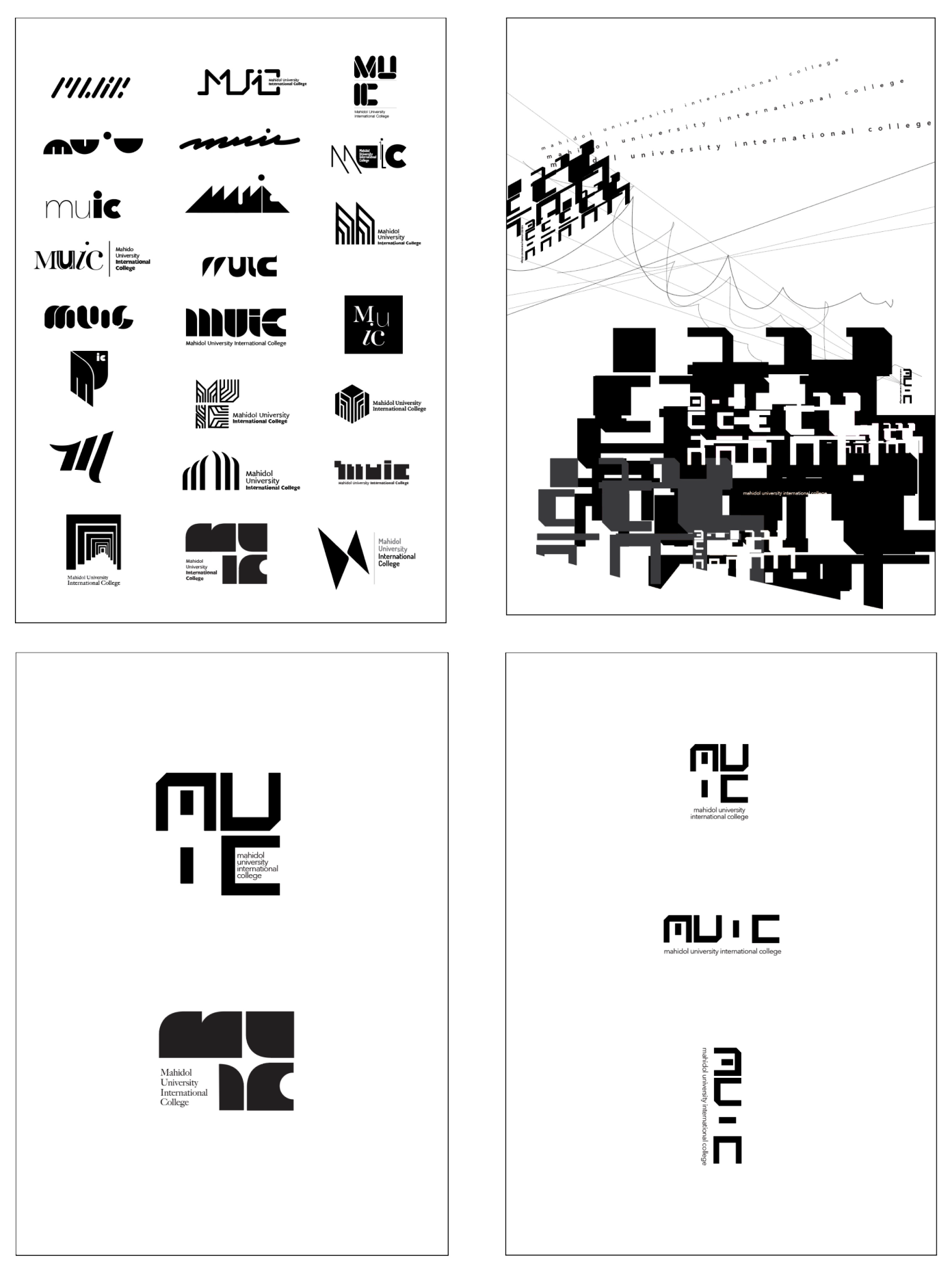
The first concept that was considered conceives the college as a whole made up of six divisions. Different iterations of an M
letterform were imagined as a structure composed of 6 elements, with references to parallels, verticality, and ordered unity.
Another direction uses the key letters MUIC and explores the collection of four letterforms as an interactive group, some more unified and some heterogeneous, and ranging from less to more abstract. From this series two finalists emerged. Both are eometry- and grid- inspired, and built from line and shape,
respectively.
One direction, line based, has a sharp clean presence and a futuristic feeling. Using strict vertical and horizontal lines the forms are cut from four, square spaces. This direction feels more weighted toward scientific, logical and technical qualities. The second direction, shape based, still has a clean, strong geometry, but at the same time has a softer and warmer feeling. The overall
sense of this direction is more retro and leans toward a more creative, playful and youthful identity.
Techniques and materials
Digital design using Adobe Illustrator
Size or Mins.
Variable dimensions
To be displayed as a series of A2 posters
Photos
Submitted as separate JPEG files, “MUIC logo” 1-6