Categories
Clean design

Monsters of the Sea

“>”>Monsters of the Sea

“>”>Miss. Ploy Nikadanont

Introduction

Microplastics, according to study, circulate throughout our bodies and may become lodged in organs. Although there is no information on how it affects our health, researchers are
concerned since microplastics have been shown to harm human cells in the laboratory and air
pollution particles have been shown to enter the body and cause millions of deaths each year.
How can we solve this problem since humans depend on plastic for livelihood and
convenience. It is, however, suffocating the earth, the animals, and ourselves. When plastics
are used and discarded, they breakdown into particles known as microplastics. Microplastic is
now found in virtually every part of our life, including the air we breathe, the food we eat, the
water we drink, and even in our own blood. The majority of microplastic particles found in
human blood are PET plastic, which is commonly used in beverage containers, and
polystyrene, which is regularly used in food packaging.

The discovery of Microplastics in human’s blood reminds me of the famous quote by Jean
Anthelme Brillat-Savarin (1755-1826) “Tell me what you eat, and I will tell you who you are”…
What kind of creature are we if we consume animals and vegetables that have been tainted
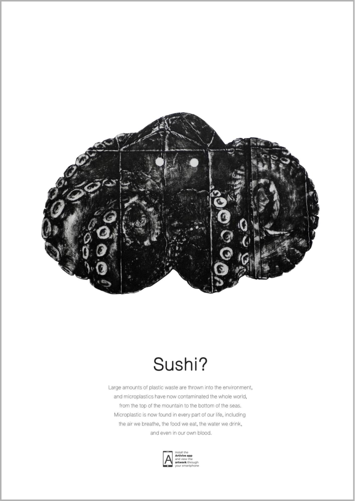
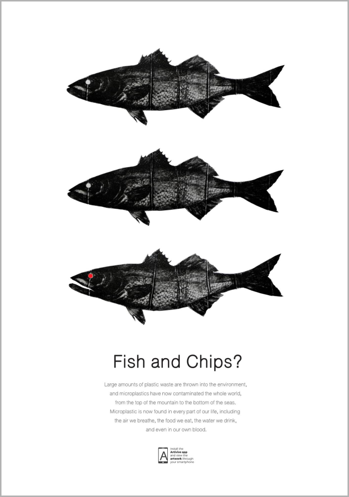
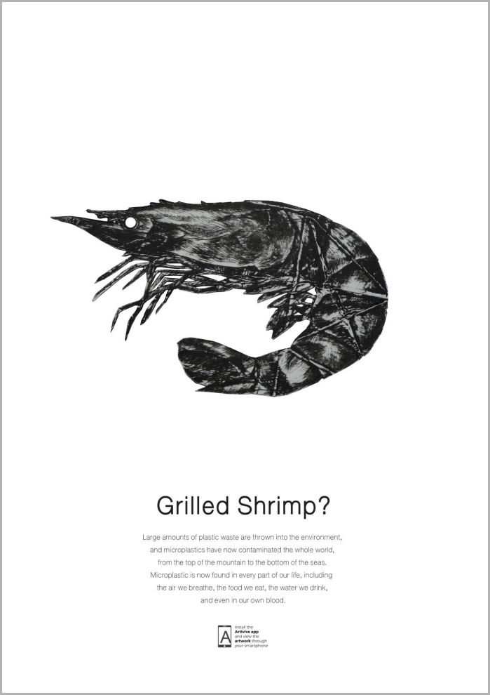
with microplastic? This was the inspiration for creating “Monsters” project, which uses food
packaging to create printing plates to illustrate how those packaging contaminates plants and
animals which are our food and gradually impacts our life. The first series of Monsters is
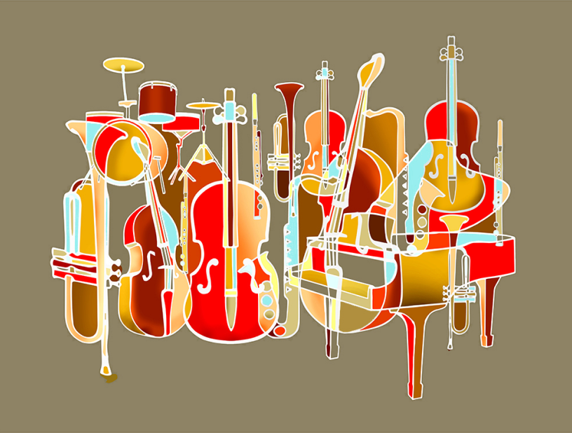
“Monster of the sea” which consists of three pieces of prints that depict marine life that has
been impacted by microplastic contamination. The printing method was chosen for this project
because it is one of the most toxic techniques and able to produce textures that symbolize
pollution. Additionally, because it is repeatable, it helps depict our unchanging behavior that
contributes to environmental difficulties today. Along with the traditional printing process, this
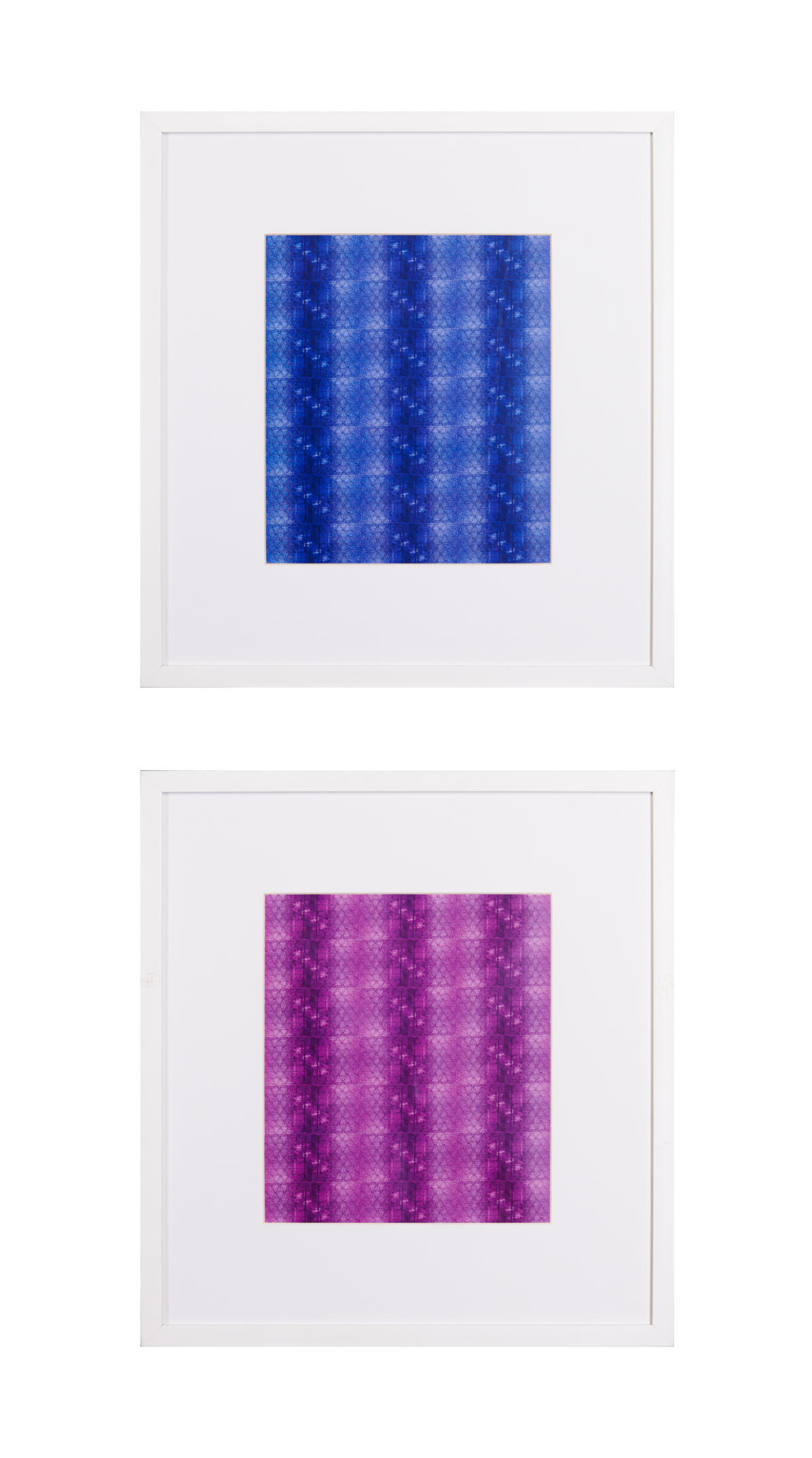
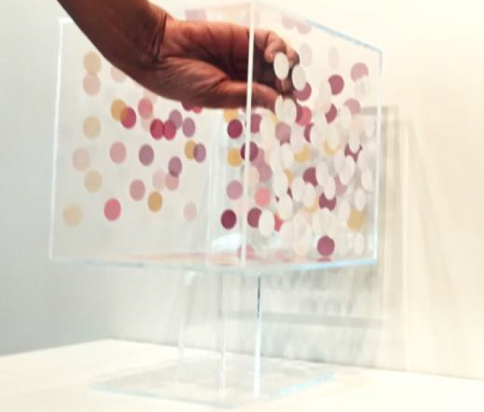
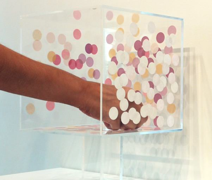
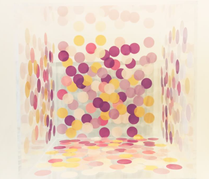
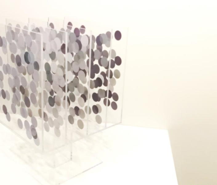
project also utilizes augmented reality (AR) to narrate story through moving image and sound.

According to the project’s objectives, which include recycling food packaging, exploring new
possibilities of aesthetic expression through traditional printmaking and digital techniques, and
raising awareness about environmental issues focus on microplastic pollution, the result will be
analyzed by using a SWOT analysis below:

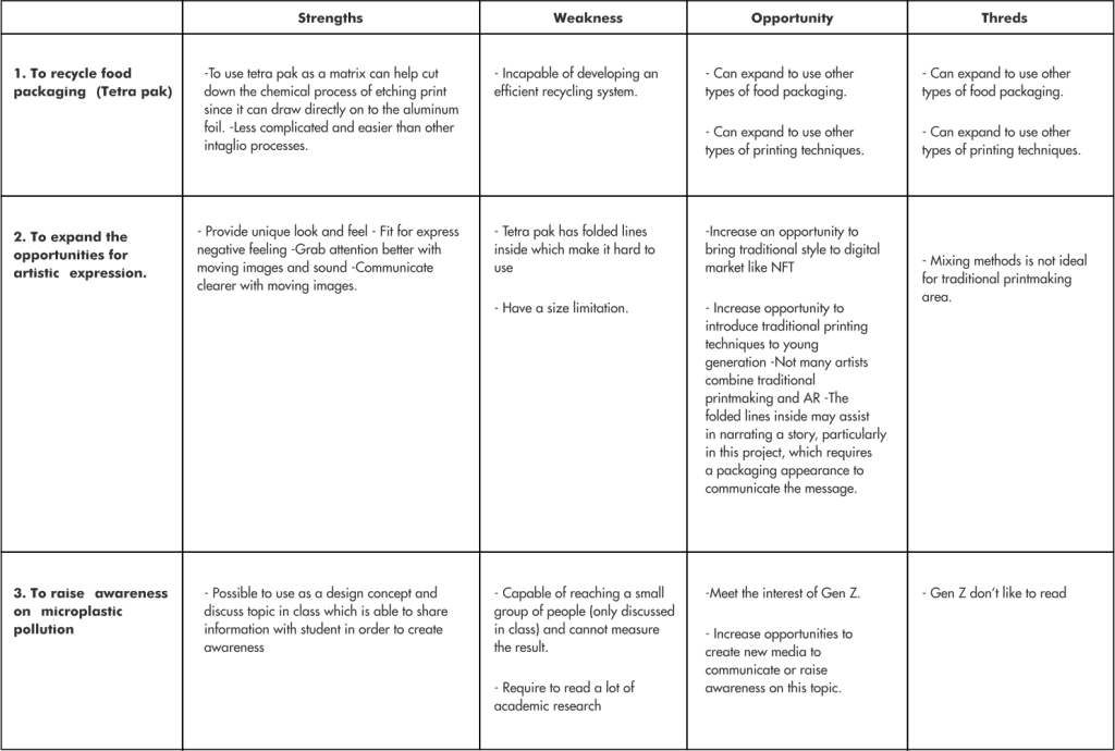
In summary, to use tetra pak as a printing plate cannot develop an efficient recycling system and have the possibility to produce non-recycle garbage which provides a lot of carbon footprint during the termination process. However, it can help cut down the chemical process of the etching technique that needs to use acid to bite the copper plate.

In terms of aesthetic pleasing, tetra pak print provides a unique texture and look with folded lines on the printing plate. However, these lines could challenge the artist to work on composition, and could distract the eyes of the audiences. Combining traditional printmaking techniques with AR technology can help with communication, as moving images help in conveying the message. The mixed techniques also help provide opportunities to bring traditional to the digital market. But, in the area of traditional printmaking, this might not be the ideal and could affect the value of the artwork.

A topic of microplastic pollution has the potential to be used as a design concept and discuss
topics for brainstorming in classes like ICCD210 CD Studio and ICCD103 Research Studio.
Also the student might be interested in this topic since Generation Z is more concerned about
environmental issues than other generations. However, it might be too complicated and require
reading a lot of academic research. According to the survey conducted in Mahidol University
International College in March, 2022 found that 76% of participants don’t like to read and think
that infographics and motion graphics can provide information better and easier to understand.
So, this could be considered as an opportunity to design or create media for communicating
environmental issues to Generation Z and the Monster project might be used as a pilot project
to find out the design approaches and storytelling that meet the needs of the university
students.

Objectives Aims or Purposes

The project was developed to determine the methods for recycling food packaging. Also aims to experiment with combining augmented reality with classic printing techniques to find out new possibilities to communicate ideas and aesthetic expression. Lastly, this project hopes to be a part of raising awareness on microplastic issues by applying the topic into class assignments.

Process or Methods

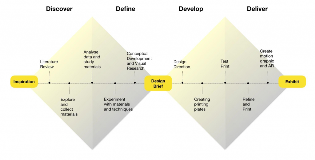
Discover: In order to understand and get insight information of the selected topic, this section involves research, mostly a review of the literature on microplastics, printmaking techniques,
and the use of augmented reality technology. This section also includes observation, data collection, and material collection. Due to the fact that food packaging particles are present in human blood, this section also includes exploring and collecting food packaging.

Define: All data and materials collected in the previous section have been analyzed and
experimented in order to define the right materials and techniques for the project. The
experiment discovered that when food packaging such as tetra pak and milk cartons are used
as a matrix, Drypoint method could provide better outcomes than other intaglio processes such
as collagraph and aquatint. In the AR part, found that the Artivive application works better than
others. Visual research is also included in this section since it is a method for defining a design
brief that involves the development of clear design concepts and the exploration of various
design directions for the subject matter.

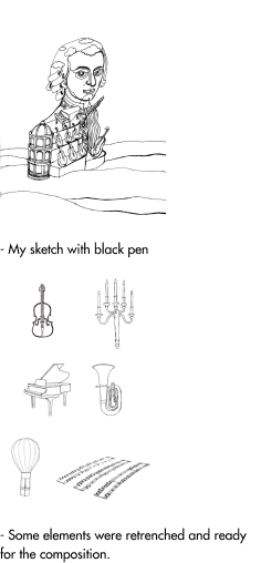
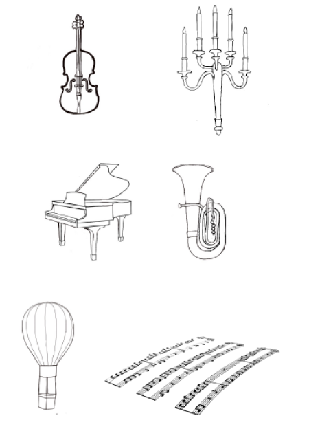
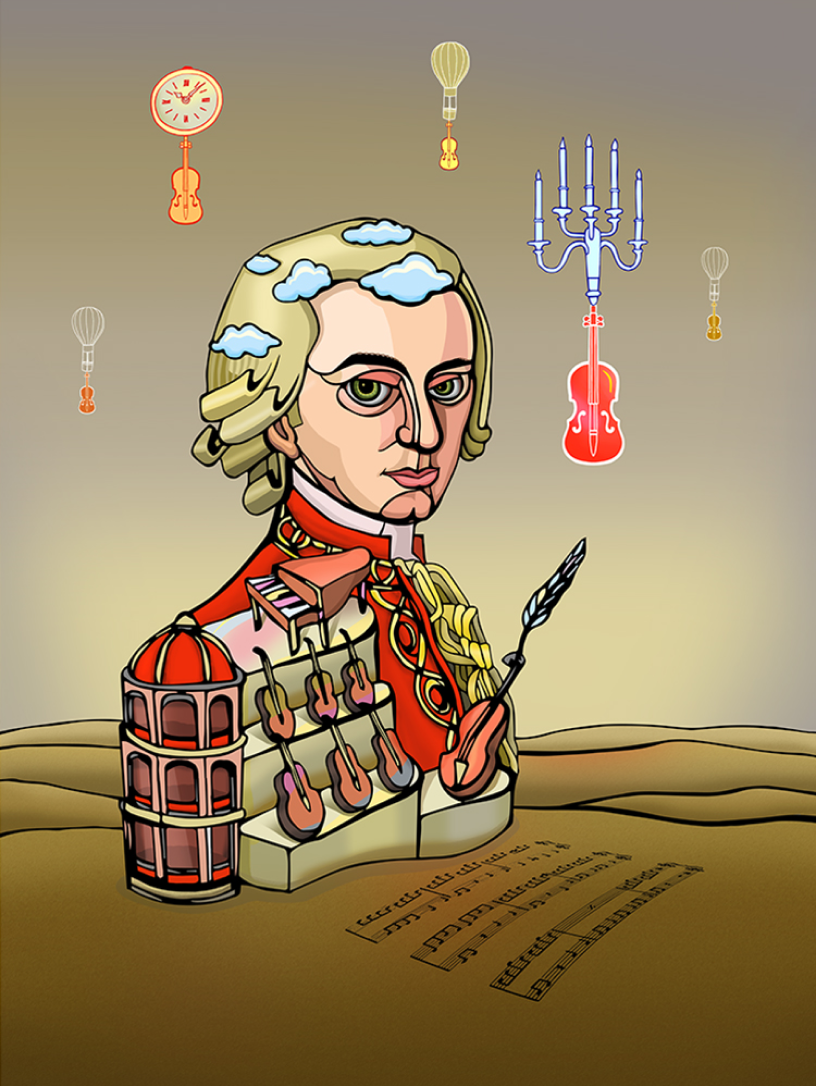
Develop: The process of developing the design brief into final products began with a series of
sketches to illustrate the concept. Then select the design that supports the concept the best.
After that, develop the final design using Adobe Photoshop. Then, prepare a printing plate for
the test print.

Deliver: Test print with different types of printing paper such as normal water color paper and
Fabriano paper. Also tried the different weight pressures of the printing press. If the result is
unsatisfied, the needle can be used for fixing or adding more details on the printing plate before
inking and reprint. After finishing the printing process, select the best editions for scanning in
order to animate in Adobe Photoshop. And process AR on the Artivive website.

Things to be aware of during the printing process are: dirty fingerprints on the printing paper
while removing work from the printing press. Additionally, if the printing paper is overly moist, it
may adhere to the printing plates, causing them to rip apart when removed. If printing plates are
wiped too frequently, details are lost, whereas too much ink on the plates splashes out and
creates a dark texture that conceals details.

To design the appearance of the monsters, it starts by studying photographs of sea life, scientific illustration and Gyotaku which is Japanese traditional fish printing. Then trying to apply the characteristics of fish printed by Gyotaku techniques to the design by focusing on the
agony look of the dead fish: bulged eyes, white eyes and open mouth. However, with the look and feel of the Japanese printing technique which uses liquid ink, gives a natural and non toxic feeling which does not fit the design theme. Then, Drypoint, which is the Intaglio process, has been selected since it provides a dark, mysterious and negative vibe which goes well with the creation theme. Also the techniques itself are toxic which can help narrate the story that involves environmental issues. The colors which are added in the AR part are the colors from
the samples of microplastics found in the sea which include blue, red, green, purple (pink), black and brown.

Techniques and materials

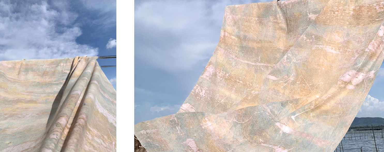
Material used for creating printing plates is tetra pak since it is widely used to contain drink, it consists of 75% paper and 25% aluminum foil and plastic which has potential to be used as a matrix or printing plate since it is not too hard to create incise lines directly on to the plate. To create a printing plate, start by printing the final design that was made in Adobe Photoshop on a stencil paper (can be inkjet or laser print). Then, cut open and clean the interior of a tetra pak
and allow it to dry. Transfer the design from the stencil sheets onto the tetra pak by using pen tracing the outlines of the design.Then, create details by using needle draw directly onto the plate. Then inking the plate and ensuring that the ink is contained inside the incised lines, wipe the plate clean with paper. Place the plate on the printing bed and cover it with moist printing paper. Cover the printing paper with a woolen cloth before rolling the printing press. Remove the work from the printing press with clean hands and allow it to dry on the wood panel, holding it in place with water-based masking tape.

After the printing process is complete, allow the work to completely dry for one day. Then
remove the artwork off the panel and scan it at a resolution of 300 dpi. To animate the files, open them in Adobe Photoshop. To begin, separate the design from the background and the parts meant to be animated. Then create a movement shot by shot (1 layer 1 shot). Use tools
such as clone stamps and paint blood rotouch on each layer. Then use the timeline function to move the image. When completed, save the file as a gif. format. To produce AR, log in to
Artivive account at https://bridge.artivive.com/#!/login and upload gif files and wait for the program to process.
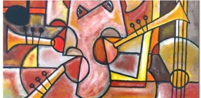
Size or Mins.

Monster of the sea no.1
Drypoint, Photoshop, AR
29.7×42 cm. (2022)

Monster of the sea no.2
Drypoint, Photoshop, AR
29.7×42 cm. (2022)


Download

Categories
Clean design

The Melody of a Country Boy Growing to an Adult in Bangkok

The Melody of a Country Boy Growing to an Adult in Bangkok

Assist. Prof Pakorn

Introduction

Impressions in life come from the past and last up to the present. They come from childhood and go to old age, among the environment that changes. Some people live in the country when they are young but must move to live in a big city. An impression when he or she was young comes with them to the big city. We can call it nostalgic traveling, when someone grows up in different circumstances. An impression of fabric and weaving in the village follows me everywhere. When I travel many provinces in Thailand, I like to go to see the weaving villages and fabric shops to see and to buy and to appreciate. I love the color, textures and patterns. All that has stuck in my head since I was 8 years old, 12 years old, and 16 years old when I went to study in Bangkok. When I moved to Bangkok, I would usually go to see the fabric shops at the shopping mall. I liked their displays that made the fabric beautiful with lighting and setting. One day I was sitting on the bench at the walkway in front of the fabric shop and through the window display I saw a reflection of the Bangkok people walking by, the country people who came to live in Bangkok were walking by. I though it looked like myself walking into that fabric. People passed by again and again. That emotion, like the melody of music, really impressed me with its image and emotion. It made me want to hold on to it. So I took the pictures and found a way to capture that emotion because not only did it happen that day, but it happened with me in the past as I am a country boy from the North. The fabric usually uses purple and indigo because they are popular there. So I used these two colors to represent the North. The compression of these many things mentioned above, since I was young until I am old, are replicated in the works.

Conclusion

ได้ความรู้สึกตามที่ประสงค์ เกิด แอบสแตร็ค ลุค ตามที่ต้องการและบีบอัดความรู้สึกในวัยเด็ก จากชนบท จนเป็นผู้ใหญ่ในกรุงเทพมหานคร และปะปนกับผู้คนในกรุง ที่สะท้อนลงไปบนสิ่งทอ

Objectives Aims or Purposes

To experiment with how my childhood in the village merges with daily life in Bangkok presently. And the emotion of again, and again, and again. Make the art piece depict my idea.

Process or Methods

1. Take the pictures about my traveling in the village with weaving and fiber art as my inspiration.
2. Go to the shop that sells Thai fabrics in the shopping mall in Bangkok.
3. Choose the shop and window display that impresses me. Sit down on the bench in front of the shop and look at that window display.
4. I see the reflection in the window display, people walk by, I find the impression from that.
5. Create the repetition like a melody in a song, match with the reflection of the people and the fabric in the window display.
6. put those pictures together make the repletion to feel like music.
7. Select the color of the fabric based on what I liked since I was young and living in the village.

Techniques and materials

Take the pictures and then use the computer to create an art piece. Choose the color that is typically used in Northern Thai fabrics.

Size or Mins.

The size is 31 x 36 cm


Download

Categories
Clean design

“Clusters”: The Experimental Art and the Study of Characteristics of Space When Occupied by Elements.

“>”>“Clusters”: The Experimental Art and the Study of Characteristics of Space When Occupied by Elements.

“>”>Assist. Prof. Pailin Phokthavi

Introduction

Spatial quality is always in awareness of practitioners in the fields of architecture and interior design. To serve the functions of activities is basic; however, to understand the characteristics of spaces is beyond. How we perceive the relationships between ourselves, elements in space, and space itself and how space arouse our feelings bring it closer to artistic quality.

For the experiment, it means to study the characteristic of space and present the result with artworks. Dot stickers are used as a tool to experiment the occupying on the surfaces of space and area to observe the differentiation happened in the space. The design of the art pieces are also planned to allow the audience to interact with the objects, the spaces, and the changes. The elements and presentation of artworks are aspired to imply some meanings of the critical situation that impacts the feelings of people today, such as the Covid-19 situation. Dot stickers are the representor of “cleanliness, disease-free, and safety”, and the illustrator of a cluster of people.

This work consists of 3 art pieces in the form of a small space study models, using an acrylic and frame box.

Acrylic cube#1: a space is created of when dot stickers are placed repeatedly. As the clusters of dots gradually cover the transparency of the cube shell, the space in the cube can also be gradually perceived.

Acrylic cube#2: The transparency gradually reduces when dot stickers are applied and the layers are filled, but the set of layers helps the perception of the eyes to combine all planes and leads to see as if the whole is a mass.

The frame: Studying negative space occupying by positive elements, dot stickers are pinned in the space of the frame. They are allowed to be selected where to place by the interacting audiences who need to decide the best place.

In artworks, occupying more space and area, dots become clusters. The “clean” space or the rest negative space that is available for more dots has been reduced. As in the Covid-19 situation, people who get infected occupy the space and area more and more, and our clean space or safe place is brought to be less and less. The artworks also aim to portray the meaning of the situation and motivate the audiences’ decision in select and interact with the positive and negative space when placing a new dot sticker. “Will you put your dot close to the cluster or as far aspossible in the clean area? But once the clean space becomes less, what will you do?”

Conclusion

Not only artworks have been created, but the study of space has also achieved its objectives. As an interior designer, we always work with a tangible space in the sense of realistic, providing a good space that fits best with functions or use is adequate. However, from the experiment model study, it is my first time observing the real act of a space occurring related to the change of simple elements.

All three art pieces convey the gradual transformation of space and mass occupied by dot stickers. Meanwhile, the cubes and the frame presentation and the use of dot stickers are simple tools to simply attract audiences’ interaction. In the acrylic cube#1, from the emptiness in the first place, the space is finally defined by dots. Also in the acrylic cube#2, the mass appears when the transparent layers become opaque planes by the occupying of the dot elements. The perception is deluded to combine all planes into one mass. Lastly, the frame of dot clusters represents the quality of positive and negative space when the clusters expand in the area.

Portraying the state of “clean” gradually changed to “full” of clusters, the artworks also hint at some meaning of the situation we have to face as our daily life is occupied by the situation of the disease and our clean and safe space has been run out. When a dot sticker is held in a hand before being placed on the artwork, it can represent all as a symbol of safety, a representative of one in a space, an element which transforms the space, and a creator of the clusters.

Objectives Aims or Purposes

  1. To study characteristics of space when occupied by some elements, in this case, dots are used as the elements and represent the occupiers in the space.
  2. To create artworks that can be viewed as the implied meanings of the present social issues in the pandemic; people aggregation, clusters, and disease spreading.
  3. To engage audiences to interact with the art pieces with the simplest action by attaching stickers or pinning dots, and to take part in the spatial experiment.

Process or Methods

  1. 6.1. Set up a question from background
    In interior design or architecture, when emptiness is called a “space,” it must be related to some functions served by this vacant volume. What happens inside is, most of the time, focused on. Nevertheless, the act of a space is actually farther. The characteristics of a space are absolutely related to its form of external shell and occupancy of internal elements. (Holzer, n.d.) When the shell of the volume has been varied or the elements have been modified, the space will show different characters. (Valle, n.d.)

    As a space designer, the study of characteristics of space has always been in my interest. Since to study about characteristics of spaces requires 3 dimension experiment models, it has brought my thought to a question; “can a space design be studied, observed, experiment, and at the same time, combined to or presented as an artwork?” Artistically, I believe that the study models can serve as presented diagrams as well as express as works of art. At this point, art merges with where it is related to and beneficial to interior space design.

  2. 6.2. Study the issues and develop the concept
    Space is strongly bonded to form. It is the vacancy between the boundary of the space and us. (Valle, n.d.) When form is defined, space is also defined. There is no space without its boundary. Therefore, the boundary or shell of a space plays the important role. How space will be if we can transform its boundary by some elements? Here, the transparent acrylic cubes are used as a start point of the experiment to blur the vision of space boundary, making the extent of form disappear. As each dot sticker is placed on the transparent surface, its plane becomes more apparent. Then, space in the cube becomes evident as well. The sense of enclosure is strengthened while the transparency and flow of interior and exterior are broken down by the elements, the dot stickers. (Valle, n.d.)
    This is because of our perception of space that the relationships of objects and elements are recognized when some alteration occurs in space. Two and three dimensional images and positive and negative space are instantly visualized. (Spatial Perception: Cognitive Ability, n.d.) Therefore, when some surfaces of the cubes or some negative space on the frame are filled in with clusters of dot stickers, our brains tend to piece together the rest pictures to form the space completely.

    Space and mass are companions on the other side. The absence of mass is space, while the presence of space is mass. (Ackerman, n.d.) As in positive and negative space, this relationship also takes place. The perception of mass is embedded in our senses as well. (Ackerman, n.d.) Therefore, it is impractical to study space only without mass. Space and mass are resources for architecture. Elements in space and of mass are composed, organized and linked. When changing a part, it affects all. In the panel layers cube in this set of artworks, before dots are added to the surface, there is emptiness; each plane is transparent, and it seems like there is no limitation of the boundary. Once dots are placed, the layers become more and more obvious. Since 5 layers of planes are visible by clusters of dots, our perception combines the planes into a mass.

  3. The meaning of “Dots”
    Inspired by an image of street element turned into a piece of art by dot stickers used for marking people who pass screening points for covid-19 and applied by the pedestrians, the dot stickers are selected to be the main materials in the set of the artworks “Cluster.”
Picture 1: The inspiration from street objects highlighted by dot elements

A simple characteristic of a dot is the power to draw attention. It is a primary basic element in art, giving the meaning of emphasizing, pointing out, and eye catching. Relevant to space and forms around dots, they affixes themselves in and initiate an interrelation. (Bradley, 2010) The power of a dot increases when another dot is placed next to the first one. The closer the dots are in space, the more the tension between two grows. When they come closer enough until touching or overlapping, the united dots form into a new object. The consequence of clustering dots creates a new different form of dot, or even a new plane. (Bradley, 2010) For the reason, in the experiment, the dots are used as a tool to create planes and shape a space or a mass.

Why it has to be “dot stickers”? Dot stickers are simple objects and uncomplicated to invite the audiences to interact with art. In artistic implication, in the conceptual relation to the situation of Covid-19, dot stickers can be interpreted both ways: first, attached prominently on our dress after passing screening area, they stand for a symbol of “cleanliness, disease-free, and safety”, and second, as an illustration of a cluster of people.

6.3. Design and create the experimental artworks

To study the characteristics of space gradually occupied by dot clusters and to create the experimental art pieces, two acrylic cubes and a frame are set as spaces and an area. The intention and expectation in this experiment and creation of the art are the interaction of the audiences by placing stickers inside the cubes and pinning stickers on the frame, creating the change in the art pieces and their spaces. However, the interaction is limited due to the exhibition situation that needs to be arranged online. Thus, video recording is used to capture the result of change.

Experiment Results:

Acrylic cube#1: The emptiness and invisibility of the space can be noticed in the beginning when the acrylic cube is totally clean. Placed by the dots continuously, the cube is gradually covered by the clusters. Until the clusters of dots act as planes, and the positive surfaces of the clusters have grown large enough to cover the negative voids and define the enclosure, then the characteristics of the space have been shown. By placing a dot sticker, audiences can be a part of the interactive creation of the space.

Acrylic cube#2: When the empty volume of space has been filled, or we perceive some degree of occupying in the space. Then we will observe a mass. (Bradley, 2010) From the reference, the study model has been set with 5 layers of acrylic plates placed equally as a form of a cube. As same as the cube#1, the transparency of the plates deludes the eyes to see through the layers, and the space is blurred out. When the dot stickers are applied on all planes, and the dot clusters engage the layers, the eyes instantly perceive the depth of space and mass by comparing the positions of the dots on each layer.

The frame: An area in the frame of the artworks has been occupied by dot stickers, depicting the image of clusters expanding in space. The dot clusters are positive elements that occupy negative space. The intention of this artwork is to arouse the audience to make a decision where to select the clean space to pin as more and more dots are pinned, the clean area of negative space will reduce, and the clusters become larger until they occupy the whole space. The implied meaning of the art is as in the situation of Covid-19, when infected people increase, in some cases as a cluster. We have to choose the safest place for ourselves. Therefore, in this experiment of space, some interactions between the negative and positive space, the art piece and the audiences are created.

Techniques and materials

Materials

used in this artwork consist of 2 parts:

Part1: dot stickers (the elements):

Dot stickers are used as experiment elements for attaching on space surfaces to portray the clusters of occupiers in the space as well as represent the marks of cleanliness approval.

Part2: 2 acrylic cubes and a frame (the space):

Acrylic cube#1: an empty transparent 20 cmx 20 cm acrylic cube with a side opened, used for the experiment of space.
Acrylic cube#2: empty 5 acrylic panels, set as a 20 cmx 20 cm cube for the experiment of space and mass.
Frame: an 80 cm x 80 cm white frame, worked as a canvas for the experiment and represent negative and positive space consumed by dot clusters.

Technique

Mix media: Dot stickers attached and pinned on the surfaces of the acrylic cubes and frame. (The audiences are allowed to participate in the interactive process, creating of artworks, experimenting, and observing the phenomenal of space simultaneously.)

Size or Mins.

Photos (2-5 images): Process of experiment and creating artworks
Picture 2: The emptiness of initial space in the cubes.


Picture 3: Experiment, interact, and record the transfomation of the space.


Picture 6: The Frame: the study of occupying positive and negative space.


Download

Categories
Clean design

New MUIC Logo: Developing a supplementary logo for an established educational institution that is expanding into innovative partnerships and promoting new entrepreneurial products

New MUIC Logo: Developing a supplementary logo for an
established educational institution that is expanding into innovative
partnerships and promoting new entrepreneurial products

Mr. Norachai Nanthakij /
Ms. Carol Siatras

Introduction

Mahidol University International College (MUIC) is a long established educational institution with a nationally and internationally recognised liberal arts curriculum. The International College is under the umbrella of Mahidol University and shares its traditional circular emblem. It also has its own logo and corporate identity which has been updated in recent years.

Currently the college is embarking on new initiatives outside the traditional classroom environment, and it is felt that there needs to be a new, supplementary identity. For example, the college intends to develop a range of innovative products in conjunction with local
businesses. The administration wishes to mark these products with an MUIC identity that registers the freshness of this new enterprise. The products are located in the food and nutrition category, and will be produced in partnership with external vendors, with plant-based ingredients sustainably sourced from regional agriculture.

The design problem is: How to create a new, supplementary logo for this existing academic brand that can signify the college’s strengths in science and art as it embarks on these new ventures? Many studies exist on the topic of university branding in marketing, but they are primarily conducted from a business and marketing standpoint. This study aims to produce a record from the perspective of the designer.

Conclusion

While the design phase is as yet ongoing some valuable insights and information have been gathered. The study reflects the contemporary situation of academic institutions that are being
forced to adapt in a competitive 21st century arena, in which long-established institutions must evolve and develop new partnerships and initiatives and sources of funding, recognition,
and revenue. While many research papers have been produced on the topic of university branding and identity, they largely come from business and marketing standpoint, and relatively few have been authored from the perspective of the designer.

The two design directions shown represent finalists that could allow the college to successfully avoid the hazard of using the original MU logo in a project that is outside of the sphere of
traditional education, while allowing it to project a more clean, modern and innovative identity as it brands new products. This identity can help to communicate current values of the institution
directly to a contemporary audience of students, faculty and staff.

Objectives Aims or Purposes

The objective is to explore the possibilities for creating a new, supplemental identity for this academic institution that can be used
in a still loosely defined set of circumstances. The research is ongoing as the committee has not selected the final design direction.

The designer was tasked with developing a series of possible directions for the creation of a new logo that can be used independently of the university’s now classic logo, created in 1969 (BE 2512). The new logo must be able to stand alone and independent of the existing logo, and create an identity that speaks
of the creative nature of art and science. The new logo will allow the college to pursue new initiatives in the commercial sphere.

The logo must appeal firstly to the International College community, where products may be initially launched. The
primary members are students (17-22 years) while a secondary audience exists in faculty and staff (30-50 years).

Process or Methods

The early design phase has produced several avenues of exploration within the general area of unique letterforms. As the
brief calls for an identity that can combine two sides of the college’s strengths, in science and art, the design process began
with a geometric base, signifying the cleanness and logic of science with the myriad potentials of creative exploration of these

forms. Throughout, clean, simple, modern directions were prioritized. This should yield a solution that would be easy to apply
with color in later phases.

The first concept that was considered conceives the college as a whole made up of six divisions. Different iterations of an M
letterform were imagined as a structure composed of 6 elements, with references to parallels, verticality, and ordered unity.

Another direction uses the key letters MUIC and explores the collection of four letterforms as an interactive group, some more unified and some heterogeneous, and ranging from less to more abstract. From this series two finalists emerged. Both are eometry- and grid- inspired, and built from line and shape,
respectively.

One direction, line based, has a sharp clean presence and a futuristic feeling. Using strict vertical and horizontal lines the forms are cut from four, square spaces. This direction feels more weighted toward scientific, logical and technical qualities. The second direction, shape based, still has a clean, strong geometry, but at the same time has a softer and warmer feeling. The overall
sense of this direction is more retro and leans toward a more creative, playful and youthful identity.

Techniques and materials

Digital design using Adobe Illustrator

Size or Mins.

Variable dimensions
To be displayed as a series of A2 posters

Photos
Submitted as separate JPEG files, “MUIC logo” 1-6


Download

Categories
Clean design

Indigo Ocean Fabric

Indigo Ocean Fabric

Nawatthakorn Umasin

Introduction

extraction process of natural indigos found in the coastal areas of Pattani Province in order to create the fabric with the identity of ocean blue. This creation was based on the study of documents and interview with the experts in indigos. The results revealed that natural indigos found in the coastal areas of Pattani Province generated the ocean blue dye by color extraction process or making the indigo paste pot. To clarify, 5kg indigo leaves had been fermented with 5L sea water for 2 nights. Then, the fermented water and indigo leaves were filtrated to separate them.


Conclusion

According to the work creation with the colors from nature by batik creation technique, the different color shade was obtained each time due to several intervening factors, e.g., weather, humidity, sunlight, and the duration of boiling for dyeing, banana peel freshness, indigo pot making technique, and the fabric type. These definitely affected color intensity and fastness to color stain. Soaking the drawn fabric several times, drying it in the shade, and then dyeing it again with indigos generated the darker colors. The technique and process from the trial can be adapted to dyeing other types of plants.

Objectives Aims or Purposes

Indigos refers to softwood mostly living in open area, with creeping branches and arranged small leaves (Width ≤ 1 cm and length ≤ 1cm). Blooming flowers are usually red or pink, with bean-like hulls, i.e., Indigofera tinctorial L. and Indigofera suffruiticosa Mill. When they fully grow and are ready for fermentation, hulls will turn brown to black. Indigo is an ancient dye or has been regarded “The King of Natural Colors.” In the south of Thailand, indigo dye is rarely used in textile and clothing, but rather used in architectural works for house and rood painting because it can prevent UV and wood-eating insects/bugs. This is different from Isan.

Thus, this creation aimed to extract color from natural indigos found in the coastal areas of Pattani Province for creating indigo dye or the indigo fabric. This creation was based on the study of documents and interview with the experts in indigos. The results revealed that natural indigos found in the coastal areas of Pattani Province generated the ocean blue dye by color extraction process or making the indigo paste pot. To clarify, 5kg indigo leaves had been fermented with 5L sea water for 2 nights. Then, the fermented water and indigo leaves were filtrated to separate them. Next, 250g red lime was added into the filtrated fermented water. After that, it was bubbled and left for 1 night until the indigo water turned yellowish green. Later, the natural-fiber fabric was dyed with indigo. After dyeing, food was provided for the indigo paste pot, i.e., Palmyra palm vinegar or sour sugar from jaggery instead of ripe tamarinds. Palm sugar was added to substitute for cane sugar in order to generate food balance to the indigo paste pot for further dyeing.

Process or Methods

  1. Indigo extraction, indigo paste pot making, indigo dyeing, indigo paste pot care, and indigo planting were studied.
  2. Batik and Pate creation was studied.
  3. Indigo was extracted, along with how to make the pot.
  4. Candles were printed in the fabric by batik and Pate technique.
  5. Indigo dyeing was implemented.
  6. Indigos were bred and propagated.
  7. The work was spread.

Techniques and materials

  1. 90 x 200cm silk fabric
  2. Silk threads
  3. Indigo leaves
  4. Sea water
  5. Red lime
  6. Palm sugar (Palmyra palm vinegar)
  7. Sliced sugar or palm sugar
  8. Candles for fabric printing and writing candle patterns
  9. Detergent

Ocean blue fabric creation technique and process

  1. 5kg indigo leaves were collected.
  2. The leaves had been fermented with 5L sea water for 2 nights
  3. The fermented water and indigo leaves were filtrated to separate them. Next, 250g red lime was added into the filtrated fermented water. After that, it was bubbled and left for 1 night.
  4. Until the indigo water turned yellowish green, the fabric was used as the natural fiber and written with patterns. The candles were pumped for dyeing in the indigo paste pot.
  5. The indigo-dyed fabric was soaked in sea water.
  6. The fabric was boiled with detergent to remove the candles.
  7. After dyeing, food was provided for the indigo paste pot, i.e., Palmyra palm vinegar or sour sugar from jaggery.

Size or Mins.

1 week


Download

Categories
Clean design

The Colors of Nature

“>”>The Colors of Nature

“>”>Ms. Natchana Nuanyang

Introduction

The creative work “The Colors of Nature” was inspired by the beauty of patterns and colors of bananas, an amazing and multi-purpose plant that has lived with Thai people’s way of life and culture for a long time. Bananas are available and emerge naturally as an eternal truth, perfectly created by nature in all dimensions. This research created the design of a new unique pattern by batik creation technique with natural dyes, i.e., the colors from banana sap, indigos, and sapodilla leaves based on the concept and theory of sustainability. Precious local intellectual heritage was extended, and can be manufactured as textile fabrics for commercial use in real.

Bananas are an identity plant implying way of life, and have lived with Thai people from the past up until currently. They are a traditional and cultural plant cultivated by agriculturists as their occupation. They create income to communities and the county. They are also an amazing plant, of which all parts can be utilized from stems, leaves, flowers, shoots, sap, fruits, to roots as food, clothing, and drugs. Thus, bananas have been widely utilized up until currently. They are even included in the four requisites of humans (Creative Innovation from Banana Plants to Fashion Lifestyle Products Using Sustainability Theory, 2022). Moreover, bananas also contained prominent and unique physical features, i.e., stems, leaves, blossoms, color, and internal as well as external patterns that change with their age and growth. With such beauty created by nature, it was brought as the inspiration to create the work “The Colors of Nature” by taking patterns of banana leaf sheaths, leaves, and other parts with different and uneven lines as the naturally beautiful imperfection.

In this research, the work was created by batik drawing and natural dyes, i.e., the colors from banana sap, indigos, and sapodilla leaves. These 3 types of plants would generate the different colors and dyed water concentrations of the dyed water, resulting in a fabric pattern with values of color at different levels. Besides, this research used an eco-friendly fabric type to create the work through the mixing of banana fiber fabric and cotton fiber that finally turned into

the woven fabric from the natural fibers. Textile industry currently gives precedence to sustainable product development, particularly the use of related concepts and theories; along with worthy utilization of natural resources, lower use natural resources, and promoting the concept of “design for sustainability” (Creative Innovation from Banana Plants to Fashion Lifestyle Products Using Sustainability Theory, 2022).

Conclusion

According to the work creation with the colors from nature by batik creation technique, the different color shade was obtained each time due to several intervening factors, e.g., weather, humidity, sunlight, and the duration of boiling for dyeing, banana peel freshness, indigo pot making technique, and the fabric type. These definitely affected color intensity and fastness to color stain. Soaking the drawn fabric several times, drying it in the shade, and then dyeing it again with indigos generated the darker colors. The technique and process from the trial can be adapted to dyeing other types of plants.

Objectives Aims or Purposes

This creation did not only bring aesthetic beauty, but the technique, process, and knowledge obtained can also be transferred to communities and anyone interested for further fabric product creation related to human way of life, with adaptation to meet market needs. It creates income and employment, parallel to local wisdom inheritance and awareness of environmental impacts.

Process or Methods

  1. Related literatures were review, with field survey and data collection/analysis to obtain creation approaches.
  2. Batik creation with natural dyes was studied.
  3. Trial of batik creation technique with natural dyes from banana sap, indigos, and sapodilla leaves.
  4.  The work was created.
  5. The word was presented and spread. Knowledge was transferred to communities and anyone interested.
  6. Conclusions.

Techniques and materials

Materials

  1. 100x 120cm woven fabric of mixed banana fiber and cotton fibers
  2.  Equipment for batik creation and natural dyeing
  3. Wasted banana peels from making banana flour and banana chips, indigos, and wasted sapodilla leaves from pruning of agriculturists.
  4. Mordants, e.g., red lime, alum, and rust.

Technique and Process

  1.  The fabric was boiled to remove dirt and powder. Then, it was dried completely.
  2. Banana peels and sapodilla leaves were boiled to extract the colored water for dyeing.
  3. The clean fabric was soaked in the colored water, i.e., banana sap water and sapodilla leaf water, respectively. Then, the fabric was damped-dried. Next, it was soaked in the colored water again, and dried completely.
  4. The dry fabric was drawn with candles as per the design for the desirable pattern.
  5. The drawn fabric was soaked in the colored water again twice. Then, it was damped-dried in the shade. Next, it was dyed again with indigos.
  6. The fabric was soaked in the mordants, i.e., red lime, alum, and rust, respectively.
  7. The fabric was boiled in the extremely boiled water to remove candles. Then, it was washed with clean water and dried in the shade.

Size or Mins.

1200Px * 1200Px


Download

Categories
Clean design

Yang Kuei-fei: a face that would make all flowers feel shameful

“>”>Yang Kuei-fei: a face that would make all flowers feel shameful

“>”>Asst.Prof. Lojana Manodhaya

Introduction

Yang Kuei-fei, also known as “A face that would make all flowers feel shameful” was a woman born during the Tang Dynasty. She is regarded as one of the four most beautiful women in Chinese history. Yang Kuei-fei’s life was as riveting as a fairy tale, facing its heyday to its peak. But the end was tragic as she was forced to hang by Tang Xuan Zhong the Emperor, her most beloved consort. Many people from the past to the present have brought her biography to create a play. and movies that have been produced over and over again. Her beauty has also influenced and inspired many painters from many eras to the present day who have painted many of her pictures.

I am also one of the people who were so impressed with the story of Yang Kuei-fei that led me to be inspired to create a 3D work titled “Yang Kuei-fei: a face that would make all flowers feel shameful”. By studying biographical information from books and websites, women’s paintings and clothing styles of the Tang Dynasty were studied, including paintings that modern painters have drawn Then create a new one according to their imagination. By creating an image for Yang Kuei-fei to have the appearance of a dignified woman, wearing beautiful clothes standing among a rock garden decorated with pines, plum blossoms are in full bloom. On the ground was a pile of white snow all around.

Techniques used to create this work are sculpture and painting methods using paper clay as the main material, Thai clay, and synthetic materials such as foam, doll hair, artificial gold necklaces, artificial snow, and glass sand as components. Successful works that are complete, beautiful, and have artistic aesthetics as intended.

Conclusion

This work “Yang Kuei-fei: a face that would make all flowers feel shameful” presents the contents of Yang ‘ Kuei-fei‘s imagination that she is a beautiful woman. Her face was filled with happiness as she had received a lot of love from her husband. So her life was filled with dignity and fortune that flowed endlessly. But, tragically, she could not know her fate at the end of her life she had to flee from the rebels in horror until an unexpected end.

In terms of shape, use of color, and symbolic media because the content is about presenting Yang Kuei-fei’s image as imagined. Therefore, then made a picture of her in her youth, and has a beautiful smiling face. The clothes that were worn were bright red with gold patterns. The red color represents good luck and love. The magenta and gold, meanwhile, conveyed aristocracy and extravagance which suited her personality. The surrounding atmosphere represents winter. which despite the pine and the plum blossoms in full bloom stood among the white snow that symbolized strength. and longevity cannot escape destiny Therefore, in this work, a lot of curved lines are used. From the way Yang Guifei’s arms were placed, the flower branches, the pine branches, and the arrangement of the rocks, there was also a downward curve to convey the tragic events of the future.

As for the use of paper clay molding techniques, it can respond to creative works very well with features that are easy to shape. Able to fabricate work to be complex, delicate, and also able to paint over the work surface easily. They can also bring finished materials such as artificial gold necklaces. Or other synthetic materials such as doll hair, artificial snow, and glass sand can be decorated to add detail to the work.

Objectives Aims or Purposes

4.1 To present the image of Yang Kuei-fei who is regarded as one of the four beautiful women according to their imagination.

4.2 To develop creative works with paper clay by using sculptural methods to create shapes and paintings to convey emotion and realism.

Process or Methods

study and gather information and analysis articles from the book and webpage, involving Yang Kuei-fei on the biography, appearance, behavior, and dress characteristics of the Tang Dynasty to inspire the development of the idea of drafting. There is a process of using the composition, the use of colors, and the meaning of the colors. and the meaning of trees and flowers in the works Then enter the creative process

Techniques and materials

Technically, the sculptural method was used to create shapes. together with the method of painting to convey emotion and realism
Materials: Paper clay is used as the main material for creating works, foam, glass bottles, and wire are used to form structures; Thai clay is used for jewelry making. and made in the pine bonsai part The bonsai of the plum tree, plum blossom, doll hair, artificial gold necklace, artificial snow, and glass sand were also used to decorate the details.

Size or Mins.

34.5 x 50.5 x 54 cm.


Download

Categories
Clean design

The Aesthetic of Imperfection

“>”>The Aesthetic of Imperfection

“>”>Mrs. Lalita Seemontara

Introduction

The inspiration for my artwork comes from the natural and man-made features of places I have visited and photographed. The beauty of both man-made structures and natural geological formations is reflected not only in the perfection of their appearance, but also in the imperfections arising from the passage of time. These imperfections are beauty of a different sort, formed by deterioration and erosion caused by the elements, the changes of seasons and other forces of nature. The inspiration for this artwork came from photos I took during a visit to Niagara Falls (U.S.A.) in April 2018. Nature has created majestic beauty in the mass of water plunging with force and energy over the cliffs in a straight line to the depths below. At the time of my visit, the ice and snow of winter still had not totally melted. The ice-covered soil on the frozen riverbank formed interesting and beautiful colors. The combination of melting ice, snowflakes, and complexity of soils depicted in my photos created a beautiful contrast of colors and dimensions in the foreground and background. The impressions from these photos inspired me to create my artwork.

As a textile design lecturer in fashion design department, I study the work of fabric design and also look to the works of other fashion designers. From these studies, I discovered mixed-media techniques that have been used in haute couture from 2000 to the present day. These techniques can transform flat, two-dimensional fabrics into textured, three-dimensional creations. Using these techniques, designers can create an unlimited range of artwork by blending materials and employing a variety of processes such as printing, painting, weaving, knitting, quilting, patchwork, and embroidery. For this reason, I am interested in experimenting with mixed-media techniques to further my classroom teaching in experimental textile design courses.

In my previous creations, I studied making fabric from wool using felting technique. I found that this technique can create a wide range of artwork in two and three dimensions. It can also create artwork with textures by combining different materials into the fabric, such as felting wool onto other natural fibers. In this artwork I have created, I chose to use chiffon silk. Felting techniques can also be used with certain fibers that acquire adhesive qualities after processing, allowing these fibers to cling to themselves and become fabric without weaving. I experimented and chose to use multicolored marbles with felting techniques in order to create 3-D shapes. Besides felting techniques, I also chose to combine crochet and embroidery to create a wider range of works.

Conclusion

From experimenting with various techniques, I found that by using materials other than fabric to make feltings, the work can be formed into shapes according to the materials that have been used. In the case of this work, I have chosen to use 2.6 centimeters. marbles. Therefore, the prototype that I brought has portions with a three-dimensional round texture. Wool fiber has special characteristics that are different from other fibers. Wool fibers, after being processed, can cling to each other and transform into a piece of fabric without being woven. Besides clinging to each other, wool fibers shrink during the process. Therefore, it requires a size assessment before beginning the process. The size should be 50% larger than the size desired in order to avoid any errors. The process of making the artwork takes longer than usual because it uses material other than fabric. The selected material was synthetic and solid. The fiber itself cannot be inserted through such material. This piece formed its shaped due to the material that was used in the prototype.

Objectives Aims or Purposes

  1. To create textile art with various materials and dimensions
  2. To express the beauty of imperfections in nature through textile art.

Process or Methods

  1. Create sketches and line drawings of Niagara Falls from the photos I have taken.
  2. Divide the work into two parts: the body of the waterfall and the surface of the water that
    was still icy and covered with unmelted snow. Consider what techniques to use to create
    the work from the draft.
  3. Start first with the portion showing the surface of the water with ice and unmelted snow. Use crochet techniques with colored yarn of different sizes. The reflection of
    sunlight on snow uses clear threads, as well as translucent and reflective materials. The
    surface of the water uses felting techniques combined with crochet and embroidery.
  4. The body of the waterfall uses felting and crochet.
  5. Other details can then be applied.

Techniques and materials

  1. Felting techniques
  2. Crochet techniques
  3. Embroidery techniques
  4. Wool material, varieties of yarn, silk chiffon, marbles

Size or Mins.


Download

Categories
Clean design

Therapeutic Cactus

“>”>Therapeutic Cactus

“>Mrs. Lalita Seemontara”>

Introduction

During the time of the COVID-19 epidemic, it has caused many different impacts on human society including Thai people as well. Many have lost their jobs, lost their income, or went bankrupt. Many have lost their loved ones without even saying their final goodbyes. As many things happened, fear and anxiety took over the mind. Therefore, humans must try to find ways to relax and adapt. To reduce unwanted stress or anxiety. Many people find a way out by doing mentally relaxing activities such as cooking, planting trees, etc., Cactus is another alternative plant that people grow during the COVID-19 outbreak. That allows the growers to relax with a small plant that looks strange with many species. There are different shapes depending on the species. Some species stand out with beautiful flowers. The result of seeing the cactus grow and thrive is satisfying. Human body releases pleasure substances that make the body active. concentrate more and reduce anxiety.

The name “Cactus” comes from the Greek word meaning thorny tree. It is a plant that is native to most of South America. due to having to face dry weather all the time. The inside of the cactus’s stem resembles a sponge to absorb or retain water. The stems are often ribbed or fluted to allow them to expand easily to help absorb water quickly after rain.cactus is a leafless plant to reduce transpiration thus evolved to reduce leaf shape to thorns to reduce transpiration through the leaves. The thorns also act as a barrier from insects or animals that wiling to drink water from the stems.Because the inside of the cactus is like a sponge that absorbs water. The trunk is cylindrical, tall, long, similar to a baton or round, including flat oval, etc

For fashion creative approach. This project aim to emphasise the beauty and strength of
cactus using the shape of the trunk both outside and inside. The outside is full of texture and
shape which germinated in various forms. The inside showing layers and resilient of tissue within the stems. Blooming cactus flowers adding beauty aesthetic. The nature of creating a shield to protect themselves from the environment in terms of weather conditions, hot terrain and various herbivorous insects. Various technique are use to create a form of clothing and manipulate the garment. The presence of a hard shell on the outside as well as thorns that shield the soft skin on the inside. This is like a human skin that is a defense for the skin and various organs within the body as well.

Conclusion

Inspired by cactus, a plant popularly grown to reduce stress during the COVID-19 pandemic, researchers look through the growth process of cactus that form a protective shield.

Also evolve yourself to survive the conditions of arid climate, including insects or animals that will eat the trunk. Just as we humans are recruiting things to comfort our minds and build our own defenses against stressful and fearful states from the epidemic situation. Using a fashion process to create various shapes and textures, growth processes, the defense against the various environmental conditions of the cactus are combine to create this works.

Objectives Aims or Purposes

  1. 5.1 To create fashion works inspire from the positivity of growing cactus which is a hobby to reduce stress and anxiety
  2. 5.2 To study the physical characteristics of the stems, flowers, thorns of cactus as well as their defense against arid and herbivorous nature.
  3. 5.3 To study fashion techniques by using various physical characteristics of cactus to create new surface techniques
  4. 5.4 To develop the potential by learning techniques and methods of creating fashion works that are consistent with teaching and learning and will be useful for understanding and applying in the further development of teaching.

Process or Methods

  1. Study the growth system of cactus both outside the stem and inside the stem. including the way cactus creating a shield to protect themselves from the weather and the environment , outer trunk shape, Different forms of cactus in each species, also cactus flowers and thorns.
  2. Explore fashion techniques that can be used to create new textures from cactus.
  3. Take the idea that has been analyzed to create the work. including the form of Cactus that are cylindrical, round, bushy, flat, oval, free germination that create new forms. A cross section or a picture viewed from above will give it a herringbone.
  4. Creating works starting from a 3D shape experimental sketch, experimenting with surface techniques. such as smocking, pleated dart, patchwork, etc. Also create muslin fitting before leading to the actual production.
  5. Analyze problems in both form and fabric surface techniques to develop and create actual creations

Techniques and materials

Techniques

Fabric Print, LightBox, Installation- dart stitching, which is usually used to sew clothes to shape the body But when designed in different shapes to connect or attaching, It can create a 3D shape similar to a shape of a cactus trunk.

– Smocking (Canadian smocking) Smocking It is a fashion technique that has been found in costumes since the 18th century. It involves hand sewing by holding the fabric from one point to another to form various shapes or patterns. Creating volume and flexibility from flat fabric and forming into various shapes or patterns to mimic the texture or shape of a cactus.

– Patchwork, is the cutting techniques create from difference fabric stitched together to create various patterns, often in geometric shapes. This work has brought the fabric to sew both techniques and smock first, and then they are intersected with both thick fabrics and thin fabrics to be stitched together to create dimensions To create a protective enveloping
sensation similar to the physical appearance of the cactus plant. With an outer shell wrapped around the delicate skin inside and the interesting 3D pattern from the fabric itself.

– Flowers Arts, To decorated the work with flowers that are fabricated from cactus flowers. It is a flower that shows the beauty in the drought can still be beautiful. Using the technique of heat rolling to get a shape and then assembled into a flower including the patching (Appliqué).

Materials

– Chiffon, a thin and soft fabric that represents the nature of the inner stem of cactus.
– Synthetic fabrics (polyester) the smooth and softness resembling the outer surface of the cactus.

Colors

– The color uses mainly in green tones, which is the color from the cactus. And green is a color that evokes a feeling of freshness, relieve stress and tiredness. Soothe the mind, feeling of nature, growth and fertility.

Size or Mins.

1200Px * 1200Px


Download

Categories
Clean design

The Portrait of Melody No.01 – 02

The Portrait of Melody No.01 – 02

Assist.Prof jinabhadr kantaputra

Introduction

In this time of ‘The 10th Rangsit University International Design Symposium’, I would like to express how pleasant of this classical music into the vision of digital illustration art under the title of ‘The Portrait of Melody No.01’ and ‘The Portrait of Melody No.02’

The Portrait of Melody No.01,
At first, the remarkable classical music composers is Wolfgang Amadeus Mozart. His music is best known for intelligent expressive melody. I really fall in love with his symphony music, The one really impacts me is ‘Allegro moltio, Symphony No.40’. And this music piece gave me the inspiration of creating my art works.

I found Neuroscientist Richard Haier discussed plasticity and debunks the Mozart effect, the notion that human intelligence can be improved by listening to classical music, especially works by Wolfgang Amadeus Mozart.agination,‘
© World Science Festival (A Britannica Publishing Partner) @ Brillannica.com

https://cdn.britannica.com/35/74835-050-F0B71060/canvas-oil-Wolfgang-Amadeus-Mozart-Barbara-Krafft-1819.jpg

This of Mozart image was cropped from the painting of ‘the Mozart family’. When I saw this elegant painting, I decided to express the visual of ‘The Symphony No.40’ with it.

https://cdn.britannica.com/35/74835-050-F0B71060/canvas-oil-Wolfgang-Amadeus-Mozart-Barbara-Krafft-1819.jpg

The Mozart family: Wolfgang Amadeus Mozart (seated at piano) with his sister Maria Anna (left) and his parents, Leopold and Anna Maria; oil on canvas by Johann Nepomuk della Croce, c. 1780–81; Mozart House, Salzburg, Austria. 140 × 168 cm.

https://cdn.britannica.com/35/74835-050-F0B71060/canvas-oil-Wolfgang-Amadeus-Mozart-Barbara-Krafft-1819.jpg
https://upload.wikimedia.org/wikipedia/commons/thumb/9/93/Giuseppe_Arcimboldo_-_La_Primavera_-_Google_Art_Project.jpg/236px-Giuseppe_Arcimboldo_-_La_Primavera_-_Google_Art_Project.jpg

This of Mozart image was cropped from the painting of ‘the Mozart family’. When I saw this elegant painting, I decided to express the visual of ‘The Symphony No.40’ with it.

(He composed several symphonies, concertos (for piano, violin, horn, and woodwind), piano music, chamber music, serenades, divertimenti, marches, dances and masses. His compositions are classed among the best and they are still having an impact on the lives of many musicians.)

My first art piece is also influenced by 2 artists: Giuseppe Arcimboldo and Salvador Fellip Jacint Dalí interm. I was fasinated in thier paintings which are the style and composition.

This painting inspired me, then I filled the musical instrument of symphony in the body of Mozart instead of his head as Giuseppe Arcimboldo did with his painting.

Salvador Fellip Jacint Dalí

the paintting of Salvador fassinated me. The serealistic stye of atmosphere in his painting tell the mystry and the great of nature. And I think with this style will present the intelligence of Mozart Symphony perfectly.

https://i.pinimg.com/600×315/c3/53/c1c353c164beb7e0b31f 591711b5f57994.jpg

This is the painting of Pablo Ruiz Picasso inspired me. It shows the dimensions of lines and forms of musical instruments. This style is what I want to express my second work of the Mozart Symphony.

Conclusion

I personally love the ways of my illustration’s come out. They can present how intelligent and great of Mozart music is. Finally, these two pieces will be exhibited on the website for the 10th RSU International Deign Symposium. My printed art pieces will be given to the College of Music, Rangsit University.

I hope that my design works will pleasure and inspire musical students, teachers and visitors. It will be useful and would help making the beautiful and romantic environmental in a hall or music room.

Objectives Aims or Purposes

  1. To express this classical symphony music of Mozart into the vision of digital illustration art.
  2. To give these art works to the College of Music, Rangsit University for making the beautiful environmental in a hall or music room.

Process or Methods

  1. Listen to and get inspiration from the music of Mozart, ‘The Symphony No.40’
  2. Translate the feeling of the melody into vision of art and do first sketches
  3. Research some paintings and their concepts of three artists and brush up the sketch
  4. Tracing final lines and form with black pen and finish them with Illustration Application
  5. Fill the colors digitally with Photoshop Application

Techniques and materials

Size or Mins.


The Portrait of Melody No.1
The Portrait of Melody No.2


Download